MIKE GOLD: Stupid Logo Tricks
 Sometime around 1987, DC Comics’ then-publisher Jenette Kahn told DC’s next publisher Paul Levitz that it was time to change the DC logo. Paul protested and pulled me in – I gather I was handy, or perhaps I was least likely to look like a plant. I chirped in “No, too soon. Branding takes time. Some people have just started to spend money on that logo with Dark Knight Returns and The Watchmen.”
It was painful for me to say this because I hated the DC Bullet. It was designed by Milton Glazer, and those in-lines of his were everywhere. But on cheap paper with those silly putty printing plates, his in-lines either dropped out or boogied up like a crack fiend drawing an arrow with his feet. Still, I supported Paul’s decision. If it worked for Coca-Cola for some 110 years, it should work for DC Comics for 30.
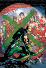
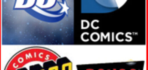
That’s about how long Glazer’s Bullet was in, and on, action. It was replaced by the one you see at the upper left-hand of the graphic above. Even after 30 years, many fans initially hated it. But I think even the most cynical liked it on the big screen… and even on the teevee screen. After a short while, it dawned on me that this was probably the best DC logo ever – except that, even though it is worthy, that particular distinction wasn’t much of a compliment.
Some five years later, DC is being rebranded. No, I’m not talking about The New 52: that’s rebranding in the sense that M&M added blue candies to their package while removing the light brown ones. The DC Spin has been sent to the glue factory, to be replaced by that which you see on the upper right of the graphic above.
I’ve started at it for a couple weeks now, taking time out for meals and New Jersey Devils games. And three words come to mind:
Boring. Stupid. And Needless.
Not to be eclipsed, the folks at Bongo Comics – represented by the logo in the lower left of the above graphic – decided to do DC one better. Their new logo is boringer. Stupider. And needlesser.
Both logos replace something that incorporates a bit of the energy and feel of the product itself. Both logos are bland at best; Bongo’s looks like an old Whitman title from the 1970s, and DC’s… well, I don’t know what the hell that thing is. It reminds me of the old toy I had back when milkmen still walked the Earth: it was sort of a pad with one plastic sheet on top of a black something or other. Kids scribbled on it with a wooden stylus, and when we got tired we’d pull the plastic sheet up off the black background and the scrawlings would disappear.
If only.
The most meaningful line in any movie was uttered by the character Governor William J. Lepetomane in Blazing Saddles: “Gentlemen, we’ve got to protect our phony-baloney jobs!” That sentiment is what makes the world go ‘round. If designers and art directors left well enough alone, we would have less work for designers and art directors.
Comics should stir some sense of wonder within the breast of the reader. These logos do not. They probably look real good on the thick glass doors that front their reception rooms, they certainly look real good in the corporate annual report (should Time Warner actually acknowledge they publish comic books), but as a device that inspires attention and attraction, they suffer from the worst sort of sanction: death by dullness.
THURSDAY: Dennis O’Neil