Tagged: Murphy Anderson

Ed Catto: Baby Got Back

You can’t judge a book by its cover, but in comics we do. That’s what sells it. Oftentimes, comics retailers need to make pre-ordering decisions based largely on just a comic’s cover.

Comics, like people, should be enjoyed for what’s on the inside. Corny but true. But like the B-side of a vinyl record, sometimes there’s glory on the flipside, like with comic book back covers.

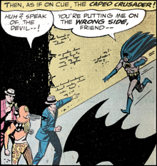
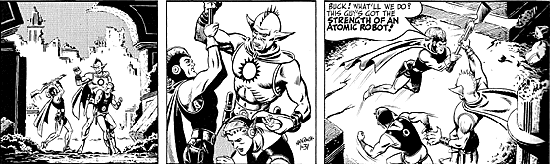
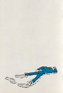
Emil Novak, Sr. runs a great store in Buffalo called Queen City Bookstore. It’s overflowing with comics and lost treasures, most reflecting Emil’s ravenous appetite for great comics. During my last visit there, I stumbled across The Spirit: The First 93 Dailies reprint comic from 1977. The front cover sported a heroic Eisner Spirit image, but the back cover, showing an exhausted Spirit collapsed in the snow was the cool part. And the courageous use of negative space really stood out. I really liked that back cover, and that sparked today’s topic.

We need not only reach back into the past for examples. There are so many clever back covers on comics today. Two, in particular, come to mind:

  • Cliff Chiang’s creating some gorgeous wrap-around covers for his Image Paper Girls series, written by Brian Wood. Essentially the back cover is part of the front cover, but with Cliff’s strong sense of design and deliberate use of color, the back covers have a life of their own,
  • Greg Rucka and Michael Lark swing the pendulum far in the opposite direction for their brilliant Lazarus This is a series set in the near future that provides a stark look at the impact of wealth concentrated amongst the few. The creators provide faux back cover advertisements each issue. The back cover adds to the story as if one of the storyline’s companies or ‘governments’ has created an ad. World-building via the back cover, if you will.

Back Cover Advertising

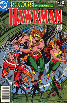
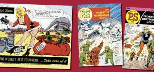
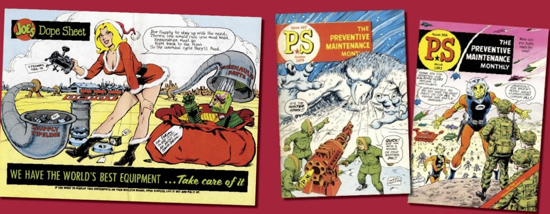
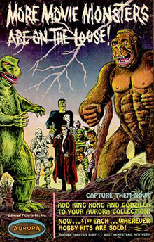
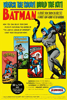
Advertisements can also create memorable back covers. I have fond memories of Silver Age back covers selling Aurora superhero model kits. The best ones leverage Curt Swan or Murphy Anderson art for on-the-nose authenticity.

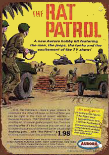
And while Land of the Giants, Rat Patrol or The Invaders weren’t TV shows I was watching back then, I sure was fascinated by their back-cover model kit ads. The Aurora monster model kits back cover ads probably deserve an entire column devoted to the creepy thrill and chills they inspired a generation of readers.

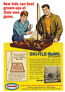
Toys ads could be hit or miss. I never warmed up to – or even understood – Skittle Bowl, despite ads illustrated by Murphy Anderson or featuring Don (Get Smart) Adams, I really loved the back-cover ads for Mattel’s Hot Birds and rrRUmblers. They must have worked. All the kids on my block collected these toys for about half a minute.

Professional Backstory

Over the years, my fascination with back covers has spilled over to my professional career. I’ve helped develop a few back covers of which I’m proud. A few examples:

  • Pagemaster was the movie that had everything going for it – a great message, hot movie stars, and a top pop music performer. It was a “can’t miss.” I was excited to lead Nabisco’s promotional program with the picture. But then, the hot movie star got weird (Macaulay Culkin) and the pop music performer (Michael Jackson) got weirder. The picture fizzled, but not before we created a great comic ad for the program. We used one of the young actors from the TV ad and we ran on the back covers of Marvel Comics for a couple of months in 1994.
  • At Bonfire Agency, our geek-focused marketing firm, and GeekRiot Media, we ran quite a few ads on the back covers of comics from lots of different publishers: IDW, Boom! Studios, Archie, Dynamite, Aspen and more. It was invigorating, and personally fulfilling, to get big brands partnering with publishers beyond the “big two”.

Coming Next Issue

I think there’s something special about advertising the “next issue” on the back cover. I could go on and on about how we live in an anticipatory culture, always looking ahead to what’s next. Have we lost the ability to live in the moment? I don’t know. That’s a whole ‘nuther topic.

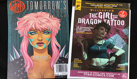
No matter: I still like using the back covers for next issues, or other comics by the same publisher. Recently, publishers like Titan and Black Mask started embracing this tactic.

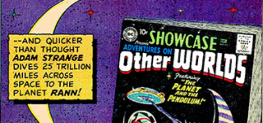
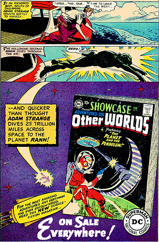
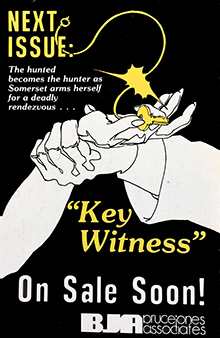
Some of the best “coming next issue” back issues were on the flip side of Pacific Comic’s Somerset Holmes. It was a gorgeous comic with a gorgeous female lead, based on a gorgeous real-life female creator. (There’s an epic tale behind it all that I’d like to get into one day.) Somerset Holmes’ back covers were creative and memorable – some of my favorites.

Advertising experts used to say that the back cover of any magazine is valuable real estate, as there’s a 50% change that a magazine will be put on a table with the back side up, I’m not sure if anyone ever truly believed that, but there’s no denying the charm of the oft-neglected comic book back cover.

•     •     •     •     •

Oh, and in the spirit of “coming next time”: my next column builds off my recent Back Issue article on the 80s comic Thriller! I’ve finally caught up with author Robert Loren Fleming and we’ve got some long-lost secrets to reveal!


Mike Gold: Time, Space, and Adam Strange

It was, for its time, the coolest comic book on the racks. Lucky for me, having just turned eight years old I was at the perfect age to best enjoy it.

In fact, I already was lusting for the comic by the time it hit my local drug store. The house ad promoting the issue had been running in several of the DC comics for a few weeks, and it intrigued the hell out of me. Back in those days when dinosaurs roamed the Earth, new comic book heroes were very few and very far between, even though 1958 was something of a boom year. DC had a title called Showcase that offered new concepts a try out – usually three issues. Yes, it was joined by The Brave and the Bold, but not until the summer of 1959. Showcase begat the Challengers of the Unknown, Lois Lane, the Metal Men, and the silver age Flash, Green Lantern and The Atom… among others.

Whereas it isn’t hard to get an eight-year old all excited, this comic book had a pedigree that few others approached. It was created by, if you’ll forgive the word, legends. Julius Schwartz was the editor and the ringleader, and he reached for his A team. Gardner Fox, arguably the most accomplished comics writer in American history, did the scripting and he co-plotted it with fellow comics writer and science fiction icon Edmond Hamilton, along with the aforementioned Julie Schwartz. The cover artist was Gil Kane, and the story artist was Mike Sekowsky.

The series was called Adam Strange. It featured a run-of-the-mill Earthling who found himself transported by Zeta Beam to the planet Rann where he fell in love with the chief scientist’s daughter while flying around, usually with her, vanquishing alien invasions and monsters and such. When the Zeta Beam wore off Adam faded back to Earth, usually right after he saved the day but right before he could kiss his lover. That drove him bugfuck, and back on Earth he figured out where and when that Zeta Beam would strike next… usually just in time to save Rann once again.

What made Adam Strange work – in 1958 – was the costume. It was classic science fiction spaceman. Jet-pack, helmet, ray gun, and all red with white accents. It was designed by still another legend, Murphy Anderson. Murphy had been drawing science fiction heroes since 1944. In fact, he drew the newspaper adventures of one of the very first such heroes, Buck Rogers, and Buck’s influence on Adam’s costume was quite evident – and very welcome.

The whole thing started as a contest. DC executive vice president Irwin Donenfeld thought what the world needed was a new s-f hero and he challenged editors Julius Schwartz and Jack Schiff. Jack’s Space Ranger was published in Showcase #15 and #16; Adam Strange lived in the next three issues.

As it turned out, neither character won – yet neither character lost, either. Adam Strange became the lead feature in Mystery In Space, drawn by the near-mythic Carmine Infantino and always occupying the cover, while Space Ranger lived in Tales of the Unexpected. For the record: Space Ranger also was created by Gardner Fox and Edmond Hamilton, but the two were as different as night and day. The main difference: Space Ranger was rather typical, and Adam Strange was exciting.

Both series lasted until the mid-60s. By that time, the United States and Russia had sent a passel of humans (and a few dogs) into outer space, and the reality of what you could see on the home screen was vastly more compelling than 1950s science fiction heroes.

Of course, in comic books nothing ever goes away, and here Adam got the best of the Ranger. Adam Strange remains a vital force in the DC Universe to this day, and now Adam Strange is going to enjoy something of a starring role in the latest DC teevee show, Krypton. Mindy Newell reported on this Monday, although she revealed only a fraction of our deeply existentialist conversation.

I’m glad to see Adam is still around, but I’m reminded of DC publisher Jenette Kahn’s reaction to the character back in 1977 when Jack C. Harris and I discussed a run in the revived Showcase. She took home a couple bound volumes from the library, read them over the weekend, came back and pronounced it “dated.”

Yup. It was. And that was the point. But DC needed to develop its astrophysical borders, so Jack pretty much kept the story, which also featured Hawkman and Hawkwoman. We renamed the series Hawkman, and it did okay.

Amusingly, Hawkwoman (or Hawkgirl) will be joining Adam Strange in the new Krypton series. This will not be the same woman from the current DC/CW teevee shows as these shows (except Supergirl) inhabit a parallel universe in which Superman, Batman and Wonder Woman do not exist.

As of yet.

Television has learned a lot from comic books.


Ed Catto: Spellbound by Batman

When Leonard Nimoy died, several comic conventions paused for a moment of silence as fans offered up the Vulcan salute. Those were lovely gestures as the nerd community showed how beloved the actor, and his signature role, was to them.

I wish that Batman’s Adam West had a signature gesture like that. A hands-on-hips pose means Superman. The Vulcan salute embodies all of Star Trek’s mythology. Television’s Wonder Woman had a spinning motion (it enabled her to change from her meek self into her heroic costume) that we of a certain age remember. Iron Man kind of owns that punching-the-ground-while-crouching pose. But TV’s Batman really could’ve used an iconic pose.

Perhaps it would be holding a bomb, with a lighted fuse, above one’s head? Perhaps that silly/sexy Batusi dance move, evoking a bat’s eyes and ears? Somehow they just don’t seem right. But he had something better.

The past weekend, the Batsignal was shining onto Los Angeles’s City Hall. And the folks behind it knew their stuff. This Batsignal was the version of the Batman emblem that Adam wore. The L.A. Times showed the crowds and the entire affair looked impressive.

Everyone seems to have an Adam West story to share. I have a few too. I was really struck by how kind and sweet the stories were. To his credit, Adam West seemed to be able to instantly understand, and respect, the different connections that fans had with his TV alter ego.

As Mark Evanier, and others, reminded us, Adam West was an actor and Batman was just one part he played. Kudos to MeTV for recently running episodes of 60s western and science fiction TV series featuring Adam West appearing in other roles, before running the very first two episodes of Batman.

And in many ways, playing Batman damaged his career. He was typecast and couldn’t get other roles subsequent to the series’ cancellation. It wasn’t until years later that he was able to figure it all out, with the help of his enthusiastic agent, Fred Westbrook. They found ways so that Adam could finally reap the financial benefits of his all-too-brief superhero years.

Sadly, Fred recently passed away too. He was an agent with a real respect for his clients. He was clearly a fanboy, but he used that drive to create engaging and profitable projects for his clients. Like Adam, Fred was a great guy too. And boy, did he love TV game shows. I don’t know if he was the nation’s biggest expert on TV game Shows, but it seemed like that to me.

I fell under the spell of Adam West’s Batman TV show, but it quickly translated into a love of comics. For many fans, seeing some of those covers we saw as kids bring indelible memories front and center.

Viewing these comics is like winning a ticket for a time machine. I’m immediately transported back to Pauline’s, the newsstand that was so close to my grandmother’s house. My dad would treat us to one treasure there (I’d always choose a comic) after our Italian Sunday Dinner each week.

Detective Comics #358 is that kind of a comic for me. There’s something about those DC silver age covers with red backgrounds that bring out the six-year-old in me. This issue features the debut of Batman’s unforgettable foe, Spellbinder!

What’s that, you say? Did you forget him? Yeah, well, I guess that’s understandable.

I think that everyone who read this story forgot about it. It’s not that it’s so bad. It’s just so bland. The Spellbinder is a bank robber with a gimmick – he can hypnotize people. And like a fairy tale, the Spellbinder fools Batman three times, until the Darknight Detective finally figures out how to defeat him.

But that cover – wow! As a kid, I had thought this would’ve been the battle of all ages! It’s all about wild colors and an undoubtedly an epic battle about to be waged. I certainly expected to see Spellbinder pop up in an episode of the 60’s TV series, but he never did.

I wonder who could’ve played Spellbinder on TV?

Holy Fashion Faux Pas! What a mishmash of colors and patterns. If it were published today, Tim Gunn would have a fit. Oh, and I’m not even talking about Spellbinder’s costume. I’m talking about those clashing Detective Comics and Batman logos. Spellbinder’s nutty costume is an absurd thing of beauty… and doubtlessly it struck fear into the hearts of comic artists everywhere. In fact, no one would draw him again for years.

My copy of this comic is really special. It’s the file copy of longtime Batman editor, Jack Schiff. In those pre-internet days, publishers kept old comics on file for easy reference. Curiously, by the time this comic was published, Schiff was no longer editor on the Batman line. But he sold his file copy collection to Tim Ash Gray of Ithaca’s Comics For Collectors back in ’92, and Tim sold them to fans.

This issue is overflowing with nostalgic treasures, including:

  • More Superheroes – There’s an Elongated Man back-up (with some sharp Sid Greene art for a change) and Superman fights for Unicef in a one-page adventure on the inside front cover
  • Lots of Toy Car Ads – Geez, if future archeologists study this comic, they’d come to the conclusion that little boys in the 60s only read comics and played with toy cars. Still, one these ads showcases artwork from beloved DC artist Murphy Anderson.
  • It’s not the first time Batman fought villains on a building and certainly not the last. After the memorial service, the skyscraper battle now makes me think of the LA tribute to Adam West and the Batsignal shining on L.A.’s City Hall.

So many of us are willingly spellbound by Batman. There are a lot of good things about that. Like a long train, we all jump on at different points. That’s kind of special too. For me, it all started with that TV series and Adam West.

Ed Catto: Murphy Anderson – The Non-Traditional Man of Tradition

PS Magazine Murphy Anderson

Last month we said goodbye to the great comics artist, Murphy Anderson. He had such a body of work, and given his impressive talents, it’s not surprising that he was working as a professional comics artist over six decades.

My gorgeous wife, Kathe, had come to love Murphy too. She was so impressed with the man, his lovely wife Helen and his son, Murphy Anderson III. (This is one case where you can’t parrot that old saw, “There will never be another Murphy Anderson” – because there is!) She and I were talking to some friends about Murphy’s passing and we were trying to put it into perspective for these folks who weren’t comic fans. I stumbled into the analogy that Murphy was the “Tony Bennett of comics.” Upon further reflection, I think that’s pretty fitting. He was the consummate professional, always delivering high quality work and was always consistent. He never changed his thinking to bend the times – neither in his art style nor his thoughts on how a professional presents himself. And like Tony Bennett, Murphy was humble, warm and charming.

But even though he never changed what he did or how he did it, Murphy leaves us with a rich scope of non-traditional work.  Oh, sure, if you’re feeling nostalgic for the great man you can pull out some old Hawkman stories or Buck Rogers strips. But this week we’re going to celebrate some of Murphy’s non-traditional work!

MS Magazine

You probably know that MS Magazine proudly debuted with a Murphy Anderson cover featuring Wonder Woman. I wouldn’t have been in their target demographic, but I know I would’ve bought this issue!

PS Magazine

Valiant AndersonIt’s hard to believe, but in the days before Instagram and cellphones, folks used to read print material when they were just hanging around. The Army knew this and created PS Magazine, a hybrid of information for the serviceman told in a light, engaging comics style. You probably know that Will Eisner worked on this, but did you know that Murphy Anderson managed the contract for years afterwards?

Prince Valiant

Pioneer’s Prince Valiant reprint series invited some of the industry’s best artists to contribute covers to the series. Murphy’s Prince Valiant was a winner:

Aurora Ads

Sometimes an advertised product looks nothing like the real thing. Safe to say that no kid’s finished model kits looked as good as they did in the ads in which that Murphy Anderson provided the art.

black-cat-ma-290x450-1473904Black Cat

In the 90s, Alfred Harvey rebooted a family property: the original Black Cat. Mark Evanier was the scripter and Murphy Anderson was the interior artist. Although not known for rendering vivacious women, Murphy could rev it up when needed (see my previous column on his stunning depiction of the lovely Dejah Thoris) and he sure did here. Keep an eye out for this gem (Alfred Harvey’s Black Cat: The Origins) when you’re diving into the back issue bins.

Super Queens

You might have known that Murphy provided the packaging artwork for Captain Action, but did you know he also provided stellar artwork for the companion Super Queen’s line? It included lovely images for Supergirl, Mera, Batgirl and Wonder Woman.

Record Albums

Ok, we’ll admit it – these weren’t quite Sgt. Pepper level, but Murphy created several record album covers for Batman, Robin and more!

murphy-anderson-cover-seduction-of-the-innocent-300x426-9511981Seduction of the Innocent

Do you love Craig Yoe’s IDW reprints (Haunted Horror and Weird Love) as much as I do? Back in 1985, Eclipse did a similar thing with their Seduction of the Innocent comics. Issue #2’s cover features the lovely Gloria Wheeler, Interplanetary Girl Reporter using elements from the 1950s story called “The Space Treasure.” The whole story, with robust Murphy Anderson pencils and inks, was originally printed in Standard series called Fantastic Worlds.

Now, before I wind it up, I might need to remind you that Murphy, the quintessential gentleman, was a Tarheel… and the University of North Carolina’s team color is baby blue. There’s an old saying in the south, “God so loved Carolina, that he made the sky Carolina Blue. There’s should be a corollary to that, something along the lines of: “God so loved the comics industry that he gave us Murphy Anderson.”

Mike Gold: My Short Attention Spam

anderson_buckrogers

I hate being bored, so over the years I’ve managed to shorten my attention span to the point when the good stuff runs out, so do I. Therefore, from time to time I have a little to say about a lot of things. For example:

Bill Finger CreditDC / Warner Bros finally gave credit where credit has long been due: appending Bill Finger’s name to Bob Kane’s as the men who made Batman a Day-One success. It is marvelously ironic that the first time I’d seen the “Created by Bob Kane with Bill Finger” line was on Cartoon Network’s Robot Chicken DC Comics Special 3: Magical Friendship, which, for the record, I enjoyed – certainly a lot more than the second one. Hawkman vs Robot Chicken? Priceless. Anyway, Bill’s name is supposed to be deployed in similar fashion on all future Batman stuff, including their electronic comics (left). It’s about time. And lawyers. And egos.

Red_Wolf_1_Young_VariantI’m looking forward to Marvel’s upcoming Red Wolf series, even though it clearly indulges in usually needless future-continuity winks such as Sheriff Steve Rogers and Mayor Wilson Fisk. Nonetheless, I’ve always been amused to see the standard Marvel heroic fantasy from the standpoint of earlier times – 1872, in this case, or World War I or whathaveyou. Our ComicMix pal John Ostrander has written more than a few of these for Marvel and they always conveyed a sense of fun. Same thing with Howard Chaykin. Red Wolf might be a little-remembered Marvel character – as was the Phantom Eagle – and I have no doubt there likely will be some sort of SHIELD reference. OK, that’s part of the fabric of the Marvel Comics Universe and sometimes it’s difficult to by-pass the opportunity to get cute. If this new series is half as much fun as Skottie Young’s variant cover (right), it’ll be completely worthwhile.

Hey, Supergirl teevee producers! If you actually say the word “Superman” on your television show, just who is going to sue you? Warner Bros? Well, actually, I know one producer who wound up being sued by his own company, so I shouldn’t be quite so sarcastic. But, hell, I am who I am. After a while going so far out of your way to not say “Superman” takes the viewer out the story. If you don’t want to say Superman, you shouldn’t be allowed to use the Big Red S. It was very conspicuous by its absence. And annoying.

WonderWomanCoversOn the other hand, I’m surprised I’m enjoying Gotham so much this season. I was ambivalent about it after the end of the first season, but two weeks into this season ComicMix columnist Marc Alan Fishman said I should check it out. He was right: the show improved significantly, particularly with respect to Bruce Wayne and Jim Gordon. Of course, the addition of Michael Chiklis to the cast as Gordon’s boss also added to the fun. The story itself ebbs and flows and is too often carried by bravura performances by Chiklis, Sean Pertwee and Robin Lord Taylor – not to mention Carol Kane, who is a national treasure. But it’s fun.

Ed Catto did a wonderful tribute to Murphy Anderson in this space a few days ago, and I second each of his statements. I’d like to bring to your attention his work on a different piece of our modern history. The very first issue of Ms. Magazine featured a story abut Wonder Woman, a worthy idea for the start of America’s first mass-market feminist magazine. The cover featured one of the best Wonder Woman pieces I’ve seen. This cover (left) was penciled and inked by my old friend, Murphy Anderson. Of course we will miss him, and of course he left us with a lifetime of wonderful artwork. A true master of our medium.

Ed Catto: Murphy Anderson – A Legend and a Gentleman

kryptonite_snack2

The world lost just lost another shining light: a brilliant artist who regularly shared his vision of heroes and adventures as he created countless pages of comics and an upstanding gentleman who shared his vision of living life with courtesy, kindness and class as he led by example.

Jet-Pack Captain-Action MURPHY ANDERSONMurphy Anderson passed away Friday at age 89. He had been struggling in recent years, but it’s still a crushing blow to those who loved the man and his work. Murphy, a prolific comic artist, was in facet one of the first wave of “fanboys” to turn professional. He was a big Lou Fine fan, and you can see wisps of that great artist’s work in Murphy’s figures and rendering. Murphy was also an enormous Buck Rogers fan and would one day professionally illustrate the adventures of this hero. He had a rich career in comics’ Silver and Bronze Ages, but also enjoyed great entrepreneurial success, managing the Army’s PS Magazine and running his own color separation business.

Murphy was an especially important artist in the Sixties, establishing the artistic gold standard of many iconic heroes for a generation of fans. His Justice League covers showed the world exactly how the leading DC heroes should look. His images of heroes like Hawkman and the Atomic Knights provided clear and engaging thrillers with solid storytelling. And his inking over so many great artists, from Gil Kane to Carmine Infantino to Curt Swan, provided something close to a house style that reflected the refined, best-in-class attitude of the DC line of that day.

Murphy was one of those rare artists who could compose fantastic stories with full artwork (pencils and inks), and yet, with his fine and precise inking, partner to make almost any artist to a little bit better. Even usual pairings, like Murphy inking over Neal Adams’ innovative and hyper-realistic pencils, produced memorable artwork, visual singing in perfect harmony.

JLofA-1A Gentleman and His Women

The females that Murphy drew were consistently pretty, but demure. They all combed their hair, had applied their make-up ‘just so’ and had spotless complexions. Any young man would feel confident in bringing a girlfriend who looked like a Murphy Anderson woman home to mother.

For me, that all changed when DC adapted Edgar Rice Burroughs’s John Carter of Mars series. In this series, a cavalry solider adventures on Mars amidst exotic landscapes and bizarre aliens. But many of the Martian cultures eschewed excessive clothing. And the strip’s love interest, the beautiful Dejah Thoris, was no exception. She was a raven-haired beauty with whom the hero was madly in love. And when Murphy drew her, it was very easy to understand why any man would be head-over-heels for her.

This series also provided Murphy opportunities for creative and non-traditional panels and page layouts. But these innovations were lost to many of us, as the eye was distracted by the beautiful figures and lush inking.

Years later, during one of my lunches with Murphy, I brought along several John Carter comics issues of Weird Worlds for Murphy to autograph. I hadn’t realized it before, but his son, Murphy, Jr., who often accompanied us, was a dead ringer for John Carter!

gospel-supermanMan And Superman

For me, the quintessential Superman will always be inked by Murphy.

As the Silver Age wound down, Murphy’s inks on Curt Swan’s 70’s Superman helped update the character, making him a little hipper and more relevant. Murphy’s inks rejuvenated the strip, with a more realism, longer sideburns and a vulnerable humanity. For me, the images of Superman casually eating a Kryptonite meatball (the deadly substance was temporarily rendered harmless) helped humanize the character in ways previously never imagined.

Murphy was a one of the most polite gentlemen I’ve ever met, and surely was not comfortable with being asked to “fix” the Superman renderings of Jack Kirby in Jimmy Olsen or Mike Sekowsky in Supergirl. But he was a true professional, and the editorial dictate of the day demanded that Superman look “on point”. And while I hate to see other artists’ work modified in this manner, now one could argue that a Murphy Anderson Superman sure looked like the real Superman.

One time as a child, my family was visiting my dad’s alma mater, Cornell University, for his Homecoming. After the football game, we were shopping at the campus bookstore and I found a curious book. It was called The Gospel According to Superman by John T. Galloway, Jr. The cover showed Superman, rendered by Curt Swan and Murphy Anderson, flying over a small town church. At that time, the last thing I was interested in was theological philosophy, but I somehow knew this was legitimate and important because it had the ‘”real” Superman on the cover. And although I couldn’t have articulated it at the time, the “real” Superman meant an image rendered by Murphy Anderson. My mom and dad thought I was nuts when I started begging for this strange, hybrid book, but as they were more understanding than even Ma & Pa Kent, in the end they relented. I read the book, but I really loved that cover.

Captainaction1exclusiveAbout this period, there was a life-sized Superman poster offered via mail order in the DC comics. The 6-foot poster, rendered by Curt Swan and Murphy Anderson, was impressive and overwhelming. Superman was flying up through the clouds complete with a peace sign hand gesture. I’m not sure why, but I brought it to my Second Grade class and it was hung on the blackboard for a day. I might have trying to impress my beautiful teacher, Mrs. Beardsley, but that’s another story for another day. I’m sure my thinking then was “What woman wouldn’t be impressed with Murphy Anderson art?”

The first time I met Murphy was in 1984 at an Ithaca Comic Convention. Now, the year before I had the distinct pleasure of being the inker for a penciled Superman image provided to us by Curt Swan. It was a valiant effort, but I was certainly no Murphy Anderson when it came to inking. As you have gathered by now, my visual“ gold standard” for Superman was the character as inked by Murphy Anderson.

At the convention, I thought maybe this provided me a kinship to Murphy Anderson. While I’m sure he was mentally rolling his eyes at me, I recall his overwhelming politeness. He almost made me feel that he and I were part of an exclusive club, having both inked Curt Swan. That’s preposterous, of course. But somehow Murphy’s most amazing talent, far beyond his art skills, even surpassing his entrepreneurial efforts, was his amazing ability to make a person feel special by just speaking with him.

Ready for Action

flash-murphy-anderson-300x450-2074131Murphy was the quintessential artist for one character even though he never drew the character’s comics adventures. In 1966, Murphy Anderson was chosen to be an important contributor to a toy called Captain Action. Much the same way that Barbie could become a teacher or an astronaut, or GI Joe could become an infantryman or a frogman, Captain Action could become other superheroes via costume sets. For many of these toys, the packaging artwork was expertly provided by Murphy.

He created images for the packages featuring heroes like Batman, The Phantom, Flash Gordon, Superman, Aquaman, Superboy, Robin and Aqualad. As the line progressed, Murphy also created impactful representations of Captain Action on in a variety of poses for expansion sets. And when the line was extended to include heroines, Murphy outdid himself with gorgeous packaging illustrations for Batgirl, Supergirl, Wonder Woman and Mera, the Queen of the Seven Seas.

Years later, Joe Ahearn and I would acquire the rights to Captain Action and one of the first things we did was to bring Murphy back onto the project. How thrilled we were when he agreed to pencil and ink a new Captain Action comic cover! He agreed to recreate the classic Batman and Robin rooftop image, which was originally a poster by penciled Carmine Infantino and inked by Murphy. In the updated version, it’s Captain Action and his sidekick, Action Boy, on the rooftop, as Lady Action flies by in the Sliver Streak. Gerry Gladston, the CMO of Midtown Comics, loved the idea and we made the cover an exclusive variant.

We had discussed him doing another cover for Captain Action. The vision for this was to pay homage to Justice League of America #1’s cover, where the Flash and Despero were playing a game of Kalanorian chess – using JLA chess pieces. My vision was to have Captain Action facing off against Dr. Evil with chess pieces of all the Captain Action costume sets, but it wasn’t meant to be. At that point, Murphy just didn’t feel he could pull it off with the standard of excellence he demanded of himself.

* * *

Murphy was a Tarheel, who made good in New Jersey, and was surrounded by a loving family and adoring fans. I had studied his thoughtful inking for most of my life, but when gifted with his friendship, I soon realized that there were so many bigger lessons to be learned from this humble, kind-hearted man. Murphy we’ll miss you and thanks for showing us how it’s done.

black-canary-murphy-anderson-550x754-2894425