Monthly Archive: February 2012

Busting

busting_coverart-300x423-3096743Back in the early days of cable, movies were rerun endlessly so if you liked one, you could burn their frames onto your retinas and it became a part of yourself. As a result, I’ve always had a soft spot in my heart for 1974’s Busting. You sit there, scratching your head, and can’t recall the film and there’s no shame in that.

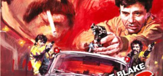
Written and directed by Peter Hyams (The Star Chamber, Outland), it is a buddy cop film before that became in vogue and is very much from the era. It has a nice grainy film stock, makes the cops and the thugs slovenly and a visual shambles. While most of Hyams’ peers set their gritty tales of big city corruption and the only honest cops’ efforts to bring down the kingpin of crime in New York City, Hyams set his in Los Angeles, although you’d be hard-pressed to tell. This is a totally urban LA, one without starlets or the Hollywood sign glimpsed in the distance. It’s a grimy city of pimps, pushers, hookers, strippers, and a few good men.

The men happen to be Elliot Gould and Robert Blake, a year before he became a big star on Baretta. They are companionable detectives, taking no guff from anyone and with a casual attitude, begin working their way to Rizzo (Alan Garfield), the man effectively running the city. Their superior tries to protect them but has given up, throwing his hands into the air, and warning the guys to stay away from the criminal. This is clearly Gould’s film as more is revealed about him and his life than Blake, but they are watching one another’s backs from gay bars to strip clubs.

I’m not giving anything away by saying they get their man, but the lessons the detectives learn along the way, and the harsh reality Rizzo reveals in the final scene gives the film an edge and poignancy missing from many of its contemporaries. Hyams’ script is sharp in subtle ways. As a director, he has some impressive tracking shots notably during the set piece, set inside a sprawling farmer’s market as the detectives hunt down three gun-wielding thugs.

The film received good notices when it first came out, with The New York Times noting Hyams “brings off something of a feat by making a contemporary cop film that is tough without exploiting the sort of right-wing cynicism that tells us all to go out and buy our own guns.” It clearly made an impact on me but it also heavily influenced Aaron Spelling, who more or less ripped off entire sequences frame by frame for his television series Starsky & Hutch. If you want a stronger version with some fun performances and more than a few comics references, Busting is finally available from MGM’s direct-to-disc Limited Edition Collection.

DC Announces “Before Watchmen”

watch2-300x4201-9875660It’s official… From the DC Source blog:

This summer, DC Entertainment will publish all-new stories expanding on the acclaimed WATCHMEN universe. As highly anticipated as they are controversial, the seven inter-connected prequel mini-series will build on the foundation of the original WATCHMEN, the bestselling graphic novel of all time. BEFORE WATCHMEN will be the collective banner for all seven titles, from DC Comics.

“It’s our responsibility as publishers to find new ways to keep all of our characters relevant,” said DC Entertainment Co-Publishers Dan DiDio and Jim Lee. “After twenty five years, the Watchmen are classic characters whose time has come for new stories to be told. We sought out the best writers and artists in the industry to build on the complex mythology of the original.”

Stepping up to the challenge is a group of the comic book industry’s most iconoclastic writers and artists – including Brian Azzarello (100 BULLETS), Lee Bermejo (JOKER), Amanda Conner (POWER GIRL), Darwyn Cooke (JUSTICE LEAGUE: NEW FRONTIER), John Higgins (WATCHMEN), Adam Hughes (CATWOMAN), J.G. Jones (FINAL CRISIS), Andy Kubert (FLASHPOINT), Joe Kubert (SGT. ROCK), Jae Lee (BATMAN: JEKYLL AND HYDE), J. Michael Straczynski (SUPERMAN: EARTH ONE) and Len Wein (SWAMP THING).

(more…)

MIKE GOLD: Stupid Logo Tricks

Sometime around 1987, DC Comics’ then-publisher Jenette Kahn told DC’s next publisher Paul Levitz that it was time to change the DC logo. Paul protested and pulled me in – I gather I was handy, or perhaps I was least likely to look like a plant. I chirped in “No, too soon. Branding takes time. Some people have just started to spend money on that logo with Dark Knight Returns and The Watchmen.

It was painful for me to say this because I hated the DC Bullet. It was designed by Milton Glazer, and those in-lines of his were everywhere. But on cheap paper with those silly putty printing plates, his in-lines either dropped out or boogied up like a crack fiend drawing an arrow with his feet. Still, I supported Paul’s decision. If it worked for Coca-Cola for some 110 years, it should work for DC Comics for 30.

That’s about how long Glazer’s Bullet was in, and on, action. It was replaced by the one you see at the upper left-hand of the graphic above. Even after 30 years, many fans initially hated it. But I think even the most cynical liked it on the big screen… and even on the teevee screen. After a short while, it dawned on me that this was probably the best DC logo ever – except that, even though it is worthy, that particular distinction wasn’t much of a compliment.

Some five years later, DC is being rebranded. No, I’m not talking about The New 52: that’s rebranding in the sense that M&M added blue candies to their package while removing the light brown ones. The DC Spin has been sent to the glue factory, to be replaced by that which you see on the upper right of the graphic above.

I’ve started at it for a couple weeks now, taking time out for meals and New Jersey Devils games. And three words come to mind:

Boring. Stupid. And Needless.

Not to be eclipsed, the folks at Bongo Comics – represented by the logo in the lower left of the above graphic – decided to do DC one better. Their new logo is boringer. Stupider. And needlesser.

Both logos replace something that incorporates a bit of the energy and feel of the product itself. Both logos are bland at best; Bongo’s looks like an old Whitman title from the 1970s, and DC’s… well, I don’t know what the hell that thing is. It reminds me of the old toy I had back when milkmen still walked the Earth: it was sort of a pad with one plastic sheet on top of a black something or other. Kids scribbled on it with a wooden stylus, and when we got tired we’d pull the plastic sheet up off the black background and the scrawlings would disappear.

If only.

The most meaningful line in any movie was uttered by the character Governor William J. Lepetomane in Blazing Saddles: “Gentlemen, we’ve got to protect our phony-baloney jobs!” That sentiment is what makes the world go ‘round. If designers and art directors left well enough alone, we would have less work for designers and art directors.

Comics should stir some sense of wonder within the breast of the reader. These logos do not. They probably look real good on the thick glass doors that front their reception rooms, they certainly look real good in the corporate annual report (should Time Warner actually acknowledge they publish comic books), but as a device that inspires attention and attraction, they suffer from the worst sort of sanction: death by dullness.

THURSDAY: Dennis O’Neil