Wonder Woman TV Costume: Wonderful or Wonder Why-Oh-Why!?

 In case you’ve been at a con, under a rock, or recently kicking your 5-a-day Fabergé Egg habit… the brothers Warner and Mr. David E. Kelley have released a photo (err.. now 2 and then some, thanks to our pals at io9) of the forthcoming Wonder Woman television series costume. Part classic Wonder Woman, part updated comic book costume, part stripper costume? Well, I’m no Alan Kistler (of Newsarama’s Agent of S.T.Y.L.E., and ComicMix fame) … but let’s break it down:
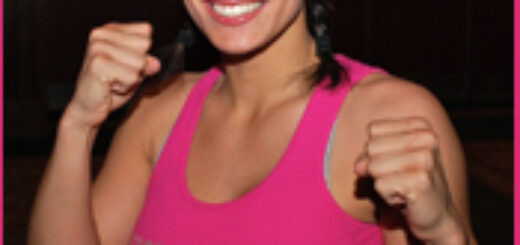
• Starting at the top, we get new Diana-Prince-In-Waiting Adrianne Palicki’s ebony locks pushed behind a fairly classic headband. While less of a tiara than the Lynda Carter era costume, we still have a nice throwback here. I’d like to note though, the Wonder Woman I think of is a natural beauty, and when I see the bright red lipstick and pink cheeks here, all I can think of is “Homer! You had it set to whore!”. If we look at the studio shot, it seems they toned it down. Thank Ares.
• Moving down, yes past the ample bosoms, we get to the top part of the costume. The shiny red bustier is topped by the always-classic eagle motif that Wonder Woman has sported for as long as she’s thrown a golden lasso of truth. Just as the Wonder Woman of the first series had, we have a glorified tube top. Is it the most appropriate thing to wear when fighting crime? No. Does it make dudes excited in their what-nots? you betcha. And look above? Proof that it holds up under … hrm…. stress.
• A little bit further down the line, we really start to separate us from the vintage look. The yellow lasso aforementioned above connects to a rather interesting looking belt. Almost a tiara-of-the-hips, if you will. I’m not sure if it’s supposed to be metal, or leather… but if it’s metal, well, Diana ain’t gonna bend down too often. And while we’re about waist high, lets mention the classic bullet-deflecting bracelets. While longer than the Carter administration models, they do reinforce the attempt here to stay true to the character. Even if they look like a quite-plastic version of metal bracelets, perhaps purchased with a WW Halloween costume.
• Beneath that costume shop quality belt comes a pair of form fitting blue pants. Akin to the blacker pair currently being sported within the pages of the DC comic, it seems the Wonder Woman of 2011 likes her legs to be covered. And in the case of the studio shot, slathered in high gloss. While I appreciate them more than the “star spangled” granny panties of the 70’s… the overall “hyper shininess” of the costume here starts to become bothersome. Luckily David E. Kelley heard the cries of the nerdy masses, and the “on-set” version seems to be more akin to denim. I even kind of dig the stars down the side. On set, we get a far less whorish sensibility here.
• Ahhhh… Das boots. Rather than give us the contrasting red boots Wonder Woman usually sports, the costumer (again, in the first photo) decided to continue the blue of the pants into the boots themselves. The traditional white stripe has been gilded. And since a chick running around in a tube top needn’t worry about arch support, she has a nice high heel to boot. Pun intended. Now I know some artists like to doll up Diana’s tootsies with a high heeled boot, frankly, it’s silly an amazon who should generally be almost eye level with Superman needs to stand any taller. And again Kelley heard the outcry. On the set, it appears Diana now sports her traditional red, less-heeled boots. The contrast is there, and unlike the studio shot… seem to fit. If anything? Tube top aside, the on-set costume looks almost “battle-worthy”. But even with these changes, geeks around the US of A may not be so enthusiastic. As our pal Katie Cook commented on her Facebook page, the new costume is akin to “…a cheap, slutty WW Halloween costume and i hate it.”
Truer words Katie.. truer words. Well ComicMixers… what do YOU think?


I couldn’t care less about Wonder Woman, but the newer costume definitely looks better. The first one really does look trashy.
As Brooke McEldowney’s Drusilla observed when trapped in Geoff’s space-opera dream (approximate quote from memory): “What is it with guys and soace babes in stilettos? Do you know how hard it is to conquer Mars in six-inch heels?”
Arrrgh. “…space babes…”
Gravatar test.
That costume is horrible. It looks like she’s going to a rave and wore that so all the people high on ecstasy would stare at her and not the neon light sticks.
It’s not the best, but I guess it’ll have to do for now. And the boots aren’t complete flats. A good angle shows a half-inch full heel. As to the rest, yeah, it could be a lot better. But it could also be massively worse. The belt, bracers and tiara look cheap, and the pointy top on the belt is a problem, like you said. But guys, I can’t draw a straight line, so I can’t come up with better.
However, I have a different concern. Is this gonna be written well, or be another David Kelley dramedy?
Grr. I wanted a line break there… Anyway. However they do this, the costuming is the least of my worries. If it’s poorly written, nobody’s gonna care. If it’s done well, I’ll buy Adrienne a truckload of double-sticky titty tape, and deliver it personally. If the show sucks, nobody’s gonna watch it anyway.
Considering the number of truly horrible things that have garnered huge audiences on teevee, i wouldn’t bet on that.
Remember that line abour underestimating the taste of the USAian public…
The costume works much better after the modifications even if it still looks a bit cheap. I’m not sure that the stars down the legs of the pants were needed, but they work all right. Same with the red boots; I’m glad that the high heels were ditched. Even the approach to make up seems a bit more subdued, which I also think is an improvement.
Miles.
I like that David E. Kelly is doing this. He may be able to get the chick and guy audience which is not easy to do.
.
Hmmm.
.
The first costume looked like it had been designed by someone with a fetish for strippers, dominatrices and 70’s era shiny disco clothing. The second looks better, but it looks a little bit schizophrenic as if they couldn’t figure out if they were going for a more cartoonish look or a more serious look. The darkened the pants and got rid of the shiny nature of them while keeping the bright and shiny top. The two combined look a little off.
.
Still, if experience has taught us nothing else with things like this it’s that the still photos don’t always do the outfits justice these days. Half the production pictures that come out these days have fans moaning about how bad everything looks and then we see the first video and… pow… looks a lot better than we thought.
.
I think the pictures look horrible, but I’ll take a wait and see position on passing any real judgments on it until after we see some solid video footage.