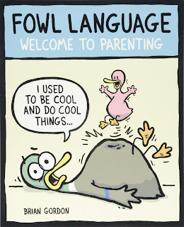
Fowl Language: Welcome to Parenting by Brian Gordon
Sometimes there are things that you know you like, but you realize you’ve never really dug into.
Brian Gordon’s comics strip Fowl Language is like that for me: I realized I’ve been seeing it randomly probably since it started (2013, I think), but never actually tried to read it. So I did.
I grabbed this book , Fowl Language: Welcome to Parenting , since it seemed to be the earliest of the three published so far. (Further exploration shows that to be true.) It collects about a hundred of those strips, which break down almost evenly into single panels (many of which would make great posters or response memes; Gordon is good at the crisp specific saying) and four-panel strips.
Gordon, as I understand it, sometimes cartoons about other things, but most of Fowl Language is about his kids. In the strips collected here – from the 2013-2016 time period – there were two of them, first a boy and then a girl, and they were very young, first babies and then toddlers and maybe up to preschoolers. You know: the loud, demanding, incoherent , psychopathic years.
My children are vastly older, which may make reading comics like this more distant but also makes them more entertaining – I can remember all of that, but the scars have mostly healed.
They are all from the point of view of the father, who is not exactly Gordon. His name is “Dickie,” but that comes up almost never. Well, and also he’s a duck, like the rest of the family – you might have noticed that. It’s a cute cartooning thing, and it ties well into the title, which also refers to the fact that Dickie is admittedly not the world’s best parent.
So this is somewhere in the humorous-parenting world alongside Ian Frazier’s “Cursing Mommy ” pieces and Guy Delisle’s “Bad Dad ” books. That’s good company to me, and Gordon can do both the funny and the sentimental. Also, to be clear, his sentiment is modern and inclusive, not the same old vague American glurge , with great comics on GTA games, gay marriage, and how kids can be assholes. (That’s not my language: that’s straight from the comic.)
I expected to like Fowl Language in larger doses, and I did. There are two more books: I might have to find them, and see how the duck-kids have grown up, and if Gordon is cartooning about pre-teen hell these days. I bet he’d be great at that, too.


Reposted from The Antick Musings of G.B.H. Hornswoggler, Gent.