Ed Catto: Frank Robbins
 When I was a kid I’d make the trek to Lewis’ Drug Store to buy comics with my allowance money. Maxwell’s Food Store had a better selection, but that was on the other side of the treacherous “Five Points” intersection, and I wasn’t yet allowed to cross that on my own.
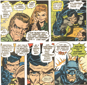
Detective Comics, starring Batman, was a favorite, and you can make a case that some of the very best Batman stories were appearing each month during that early 70s period. They were fantastic thrillers by Denny O’Neil, Neal Adams, Irv Novick, with the occasional Michael Kaluta or Bernie Wrightson cover. I didn’t know how good I had it.
So you can imagine my surprise when I picked up Detective Comics #429 and looked at the interior story’s artwork by Frank Robbins. I remember thinking “Is this a joke?” and “Is this a Golden Age reprint?” His cartoony figures and heaving brushwork was unlike anything I had ever seen. It was not my cup of tea, to put it mildly. In fact, I thought it was hideous.
 “Besides, isn’t this ‘artist’ Frank Robbins guy really a writer?” I thought. I had recognized his name as the writer credited to so many cool Batman mysteries. My pre-teen brain immediately declared he should stick to writing. I thought he was an awful artist.
I seem to remember a few issues later, in the letter’s page, a fan wrote that he felt the same way. Like me, that fan didn’t know what to make of Robbins’ artwork. One of his snarky comments stuck with me: he said that Batman looked as if he had just finished working on the Batmobile’s engine and was covered in grease!
But things change. And in this case, it wasn’t the artist and it wasn’t the artist’s work. It was me.
Over the years, I’ve grown to appreciate Frank Robbins. He’s now one of my favorites.
As my tastes have matured, I’ve grown to realize that there are so many types of art. It’s so much more than just “who can draw the most realistically.” Way back when, Neal Adams was probably my favorite artist. He probably still is one of my very top favorites (as both an artist and as a person). But with age, one develops an appreciation for different artists’ skills and visions.
I’m not the only child of the 70s that has learned to love Frank Robbins’ work later in life.
 Frank Robbins has a flavor that’s all his own. Oh, many will point out that he’s from the same school as Milt Caniff and Noel Sickles, but I think he’s more than that. I think he’s gone beyond that wonderful style and his artwork has established its own coherent universe.
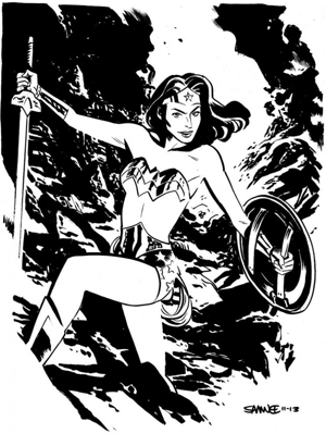
Contemporary artist Chris Samnee is the same way. He’s clever and pushes the envelope routinely. When I read a Samnee story, I feel like there’s a whole Samnee universe out there. A universe where all the visuals fit together and more importantly, are fascinating and beautiful to behold.
Mark Waid, Samnee’s frequent collaborator, recently told me “Chris Samnee is one of the most talented storytellers I’ve ever had the privilege of working with. His linework is spot-on, the way he spots blacks and uses contrast is masterful, but it’s his ability to tell the most story with the least amount of extra lines that I most appreciate. It’s a lean look without an ounce of fat.”
As usual, Mark is spot-on.
I’m not yet ready to argue that Frank Robbins is the Golden Age Samnee or that Chris Samnee is the modern age Frank Robbins, but I’m getting close. In reality, both artists’ work is brilliant and can be enjoyed without any forced comparisons. But you get the idea.
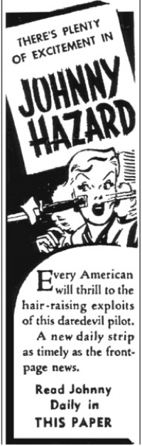
And that’s why I’m loving Hermes’ Press Frank Robbins’ Johnny Hazard: The Newspaper Dailies collection. This adventure strip ran for an astounding 33 years – from 1944 to 1977. Again, it was initially cut from the same cloth as Caniff’s Steve Canyon or Sickles’ Scorchy Smith. But in reality, Johnny Hazard started more like Indiana Jones and ended up more like a Sean Connery 007 movie.
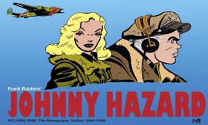 This wonderful newspaper comic strip jumped right into the action, as Johnny Hazard was a WWII pilot. These gorgeous Hermes volumes start with the very first strips.
I’m very appreciative of the format of these books. They are landscape style with two daily strips per page. Robbins artwork has an extreme sense of urgency, but there’s so much detail that the reader is caught up in this wonderful push-pull. On the one hand, you can’t wait to find out what happens next, but on the other hand, the eye is lured into lingering over the figure work, the lush backgrounds, the stunning aircraft art or Robbins’ pretty girls. These books fulfill each of these artistic interests.
And while I’ve been gushing about Robbins’ artwork, I’m surprised how much I enjoy the characterization of the initial female lead. Brandy, a love interest introduced early in the Johnny Hazard continuity, is fresh and fun. She’s a plucky mix of Eve Arden’s confident wit mashed up with Veronica Lake’s stylized sexiness. She’s a memorable character and I want to see more of her adventures.
 I recently spent some time reviewing original Frank Robbins pages from the 60s. By that time, his style had progressed and he became masterful with his rendering and pacing of the globetrotting adventures. It’s astounding how comfortable Robbins was rendering everything from downtown Hong Kong to mountain climbing adventures – sometimes back to back.
But the Hermes collection showcases work from years before that. Right now, four volumes are available and the fifth one is scheduled for this November. The good news is that with the abundant adventures that Johnny Hazard enjoyed, there’s years of material to be collected.
In retrospect, it’s a shame that it never made the leap to other media. A radio adventure or a 60s TV show seem like no brainers. Johnny Hazard toys and merchandise would have been fun. Why wasn’t there a Big Little Book? Why were his forays into comic books so rare? At the very least, in ’66, Johnny Hazard should have had his own Captain Action costume set.
My younger self wouldn’t believe that my middle-aged self would be so enthusiastic about Frank Robbins artwork. But then again, I used to think girls were icky and wine tasted awful. I’m grateful for my maturing tastes.
Hermes Press Johnny Hazard: The Newspaper Dailies Volume 5 is available November 29, 2016. Like all this series, this is reproduced entirely from the King Features Press Proofs.


