Review: ‘Watching the Watchmen’
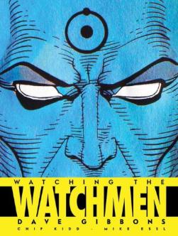
Watching the Watchmen
Dave Gibbons
Titan Books, $39.95In January 1985, DC Comics sent me to England to begin meeting with the talent working across the pond, reminding them of our needs and working environment. Dick Giordano and Joe Orlando had been out a few years prior so this was like a booster shot, a tangible sign we loved them and wanted to keep working with them. Titan Books’ Nick Landau helped me organize two group dinners with the rising stars working for [[[2000 AD]]] and [[[Warrior]]] and it was first introduction to them all.
Apart from that, though, was an afternoon session with Alan Moore and Dave Gibbons. Alan’s work with [[[Swamp Thing]]] had already proven captivating and I was an instant fan. Dave’s work was newer to me but I immediately liked his style. Interestingly, Dave’s first issue as penciller of [[[Green Lantern]]] and Alan’s first issue as writer of [[[Saga of the Swamp Thing]]] were both cover dated January 1984, just months before I joined DC in the actual January 1984 so I had a year to know their work before meeting.
Both were brimming with enthusiasm for [[[The Watchmen]]], the project they were just getting started on and I had heard about in the hallways. We spent the afternoon sipping tea at the Tower Hotel as Dave pulled out pages of drawings and sketches while Alan talked through the themes of the series. If Dave’s chronology in [[[Watching the Watchmen]]] is correct, our meeting was weeks before the first script was delivered. By then, though, they already had the tag line “Who Watches the Watchmen?” and the bloody smiley face design.
This was going to be a sophisticated story, the like of which was just beginning to find a place amidst the more traditional good versus evil stories that filled the racks. That translated to cover design and even the gents’ notions of how to market the book. Dave showed off designs for cocktail napkins and coasters that they’d imagine DC printing up to entice college kids and adults to be made aware there was something new to read.
Sadly, those marketing designs seem to have vanished but most of Dave’s other designs, sketches, notes, annotated scripts and paraphernalia was retained. The result is this handsomely designed book that enhances your enjoyment of the graphic novel and keeps you enticed until the feature film finally arrives in March.
Gibbons writes honestly about the creative process, nicely explaining how things were done back then compared with today. His recollections are vivid and explain much of what went into the process of conceiving something entirely new rather than rehashing the Charlton heroes (truth be told: I was the one to commission Dave to draw the characters for the aborted [[[Comics Cavalcade Weekly]]] for that very reason). Some of his personal thoughts about favorite characters, scenes, and moments would have been icing on a rich, delicious cake.
Chip Kidd’s design lets the work breathe and makes certain you can see the detail in the thumbnails or color guides. He takes Dave’s traditional comic book approach to storytelling and enhances it with size and scope. My only quibble is that he lets thumbnails run in the gutters and spoils some of the clarity. Also, it’d be nice to have seen more of Alan’s scripts and Dave’s notes to better understand the process.
Overall, the big is a huge visual treat and one of the few in-depth looks into the creative process behind any single title. It’s really the first Making Of book for a comic book that I can recall and there’s no better series than The Watchmen to get the in-depth examination.