Ed Catto: Murphy Anderson – A Legend and a Gentleman
The world lost just lost another shining light: a brilliant artist who regularly shared his vision of heroes and adventures as he created countless pages of comics and an upstanding gentleman who shared his vision of living life with courtesy, kindness and class as he led by example.
 Murphy Anderson passed away Friday at age 89. He had been struggling in recent years, but it’s still a crushing blow to those who loved the man and his work. Murphy, a prolific comic artist, was in facet one of the first wave of “fanboys” to turn professional. He was a big Lou Fine fan, and you can see wisps of that great artist’s work in Murphy’s figures and rendering. Murphy was also an enormous Buck Rogers fan and would one day professionally illustrate the adventures of this hero. He had a rich career in comics’ Silver and Bronze Ages, but also enjoyed great entrepreneurial success, managing the Army’s PS Magazine and running his own color separation business.
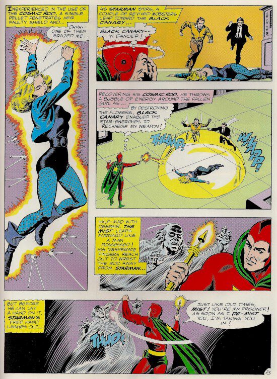
Murphy was an especially important artist in the Sixties, establishing the artistic gold standard of many iconic heroes for a generation of fans. His Justice League covers showed the world exactly how the leading DC heroes should look. His images of heroes like Hawkman and the Atomic Knights provided clear and engaging thrillers with solid storytelling. And his inking over so many great artists, from Gil Kane to Carmine Infantino to Curt Swan, provided something close to a house style that reflected the refined, best-in-class attitude of the DC line of that day.
Murphy was one of those rare artists who could compose fantastic stories with full artwork (pencils and inks), and yet, with his fine and precise inking, partner to make almost any artist to a little bit better. Even usual pairings, like Murphy inking over Neal Adams’ innovative and hyper-realistic pencils, produced memorable artwork, visual singing in perfect harmony.
 A Gentleman and His Women
The females that Murphy drew were consistently pretty, but demure. They all combed their hair, had applied their make-up ‘just so’ and had spotless complexions. Any young man would feel confident in bringing a girlfriend who looked like a Murphy Anderson woman home to mother.
For me, that all changed when DC adapted Edgar Rice Burroughs’s John Carter of Mars series. In this series, a cavalry solider adventures on Mars amidst exotic landscapes and bizarre aliens. But many of the Martian cultures eschewed excessive clothing. And the strip’s love interest, the beautiful Dejah Thoris, was no exception. She was a raven-haired beauty with whom the hero was madly in love. And when Murphy drew her, it was very easy to understand why any man would be head-over-heels for her.
This series also provided Murphy opportunities for creative and non-traditional panels and page layouts. But these innovations were lost to many of us, as the eye was distracted by the beautiful figures and lush inking.
Years later, during one of my lunches with Murphy, I brought along several John Carter comics issues of Weird Worlds for Murphy to autograph. I hadn’t realized it before, but his son, Murphy, Jr., who often accompanied us, was a dead ringer for John Carter!
 Man And Superman
For me, the quintessential Superman will always be inked by Murphy.
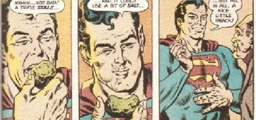
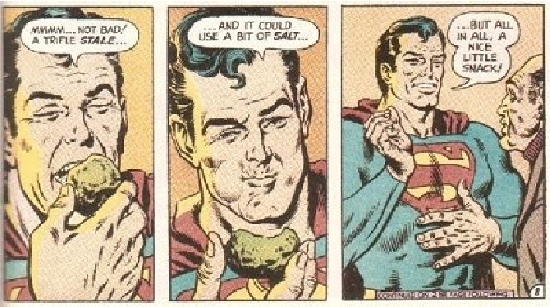
As the Silver Age wound down, Murphy’s inks on Curt Swan’s 70’s Superman helped update the character, making him a little hipper and more relevant. Murphy’s inks rejuvenated the strip, with a more realism, longer sideburns and a vulnerable humanity. For me, the images of Superman casually eating a Kryptonite meatball (the deadly substance was temporarily rendered harmless) helped humanize the character in ways previously never imagined.
Murphy was a one of the most polite gentlemen I’ve ever met, and surely was not comfortable with being asked to “fix” the Superman renderings of Jack Kirby in Jimmy Olsen or Mike Sekowsky in Supergirl. But he was a true professional, and the editorial dictate of the day demanded that Superman look “on point”. And while I hate to see other artists’ work modified in this manner, now one could argue that a Murphy Anderson Superman sure looked like the real Superman.
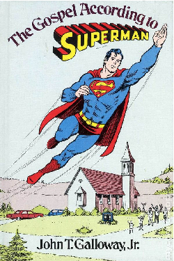
One time as a child, my family was visiting my dad’s alma mater, Cornell University, for his Homecoming. After the football game, we were shopping at the campus bookstore and I found a curious book. It was called The Gospel According to Superman by John T. Galloway, Jr. The cover showed Superman, rendered by Curt Swan and Murphy Anderson, flying over a small town church. At that time, the last thing I was interested in was theological philosophy, but I somehow knew this was legitimate and important because it had the ‘”real” Superman on the cover. And although I couldn’t have articulated it at the time, the “real” Superman meant an image rendered by Murphy Anderson. My mom and dad thought I was nuts when I started begging for this strange, hybrid book, but as they were more understanding than even Ma & Pa Kent, in the end they relented. I read the book, but I really loved that cover.
 About this period, there was a life-sized Superman poster offered via mail order in the DC comics. The 6-foot poster, rendered by Curt Swan and Murphy Anderson, was impressive and overwhelming. Superman was flying up through the clouds complete with a peace sign hand gesture. I’m not sure why, but I brought it to my Second Grade class and it was hung on the blackboard for a day. I might have trying to impress my beautiful teacher, Mrs. Beardsley, but that’s another story for another day. I’m sure my thinking then was “What woman wouldn’t be impressed with Murphy Anderson art?”
The first time I met Murphy was in 1984 at an Ithaca Comic Convention. Now, the year before I had the distinct pleasure of being the inker for a penciled Superman image provided to us by Curt Swan. It was a valiant effort, but I was certainly no Murphy Anderson when it came to inking. As you have gathered by now, my visual“ gold standard” for Superman was the character as inked by Murphy Anderson.
At the convention, I thought maybe this provided me a kinship to Murphy Anderson. While I’m sure he was mentally rolling his eyes at me, I recall his overwhelming politeness. He almost made me feel that he and I were part of an exclusive club, having both inked Curt Swan. That’s preposterous, of course. But somehow Murphy’s most amazing talent, far beyond his art skills, even surpassing his entrepreneurial efforts, was his amazing ability to make a person feel special by just speaking with him.
Ready for Action
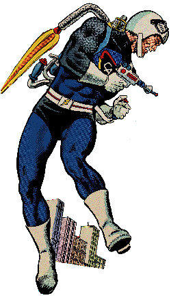
 Murphy was the quintessential artist for one character even though he never drew the character’s comics adventures. In 1966, Murphy Anderson was chosen to be an important contributor to a toy called Captain Action. Much the same way that Barbie could become a teacher or an astronaut, or GI Joe could become an infantryman or a frogman, Captain Action could become other superheroes via costume sets. For many of these toys, the packaging artwork was expertly provided by Murphy.
He created images for the packages featuring heroes like Batman, The Phantom, Flash Gordon, Superman, Aquaman, Superboy, Robin and Aqualad. As the line progressed, Murphy also created impactful representations of Captain Action on in a variety of poses for expansion sets. And when the line was extended to include heroines, Murphy outdid himself with gorgeous packaging illustrations for Batgirl, Supergirl, Wonder Woman and Mera, the Queen of the Seven Seas.
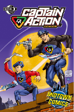
Years later, Joe Ahearn and I would acquire the rights to Captain Action and one of the first things we did was to bring Murphy back onto the project. How thrilled we were when he agreed to pencil and ink a new Captain Action comic cover! He agreed to recreate the classic Batman and Robin rooftop image, which was originally a poster by penciled Carmine Infantino and inked by Murphy. In the updated version, it’s Captain Action and his sidekick, Action Boy, on the rooftop, as Lady Action flies by in the Sliver Streak. Gerry Gladston, the CMO of Midtown Comics, loved the idea and we made the cover an exclusive variant.
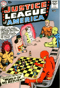
We had discussed him doing another cover for Captain Action. The vision for this was to pay homage to Justice League of America #1’s cover, where the Flash and Despero were playing a game of Kalanorian chess – using JLA chess pieces. My vision was to have Captain Action facing off against Dr. Evil with chess pieces of all the Captain Action costume sets, but it wasn’t meant to be. At that point, Murphy just didn’t feel he could pull it off with the standard of excellence he demanded of himself.
* * *
Murphy was a Tarheel, who made good in New Jersey, and was surrounded by a loving family and adoring fans. I had studied his thoughtful inking for most of my life, but when gifted with his friendship, I soon realized that there were so many bigger lessons to be learned from this humble, kind-hearted man. Murphy we’ll miss you and thanks for showing us how it’s done.