Tagged: art

Me and The Art of Ramona Fradon

Growing up, I always recognized that Ramona Fradon’s artwork was different, curvier and softer in many ways than Gil Kane or Carmine Infantino. But you couldn’t help but like her open, appealing storytelling and characters. Her artistic touch on Metamorpho and later Super Friends were perfect while she was badly miscast on things like Freedom Fighters and even selected issues of The Brave and the Bold.

From the legion of writers and artists working in the first two generations of comics, Ramona was one I had never had the chance to meet or speak with. It was therefore serendipitous when Dynamite Entertainment invited me to edit The Art of Ramona Fradon which is a visual showcase for her work and was an extended conversation between the artist and fellow creator Howard Chaykin. Chaykin spoke with her on numerous occasions and the raw transcript needed to be shaped which is what I did. But in researching her career, I realized there were pockets of work Howard never explored and other gaps that needed filling in. (And speaking of Chaykin, my overdue The Art of Howard Chaykin retrospective is finally on press and should be out in the spring.)

I was tasked with calling her myself and conducting a supplemental interview so I found myself spending about ninety wonderful minutes with Ramona last year. She was gracious and displayed a pretty good memory so those gaps filled in nicely.

It was easy, then, to take the various transcripts and edit it into a pretty coherent chronology of her life and career. The book took time to assemble given the hunt for illustrations from across her career but the work is done and I see it now being solicited in the current issue of Diamond reviews.

If you grew up on her work and want to get to know the artist, I strongly suggest you get this for yourself. I’m certainly proud of having worked on this, honoring Ramona and her work.

After the cut is the complete press release with additional details.

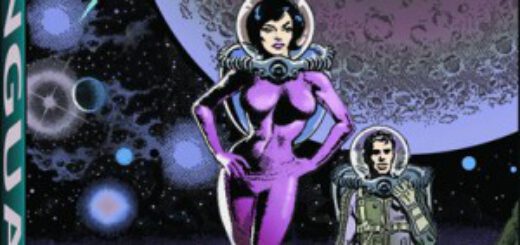
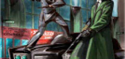
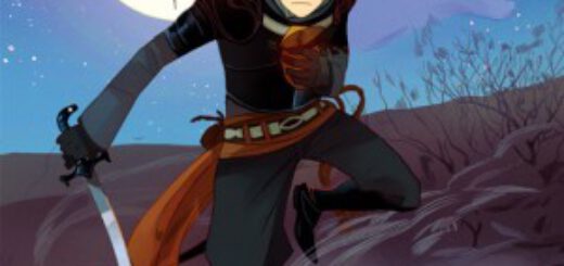
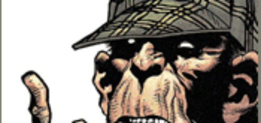
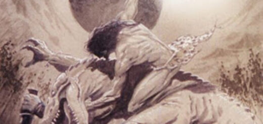
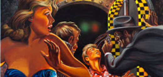
Long time fans of Metamorpho, Aquaman, Aqualad, Plastic Man, The Fantastic Four and Super Friends are quite familiar with the work of legendary artist, Ramona Fradon, but not until now will they know the whole story of Ramona’s incredible career in comics, as Dynamite Entertainment is pleased to announce the upcoming The Art of Ramona Fradon in stores on April 2012!

For the first time ever! The DEFINITIVE retrospective of Ramona Fradon’s career will be presented in The Art of Ramona Fradon. The Art of Ramona Fradon will be a hardcover book that highlights the magnificent career of the artistic legend, plus never-before-seen sketches.

Interviewed by legendary creator Howard Chaykin and featuring a forward by Walt Simonson, Fradon talks about her artistic career, accomplishments and creations from her early days at DC in the 1950’s to her later work on Marvel’s The Cat and Fantastic Four and DC’s Plastic Man, Freedom Fighters, Super Friends and more!

“I’ve never liked to see my work in print, but the way it’s presented in this book makes me feel proud,” says legendary artist Ramona Fradon. “The drawings are arranged so attractively on the pages that the not-so-good ones look good and the good ones look really good. It covers so much of my career that there are things I barely remember doing, starting with an unpublished story strip I practiced on before I got into comics. It’s nice to see I’ve improved since then.”

“In an era when 99.99 % of American comic books were produced by a male talent pool, and very few women worked in the field–mostly as writers, and mostly producing work of no particular interest or engagement,” says Howard Chaykin.  “The truest exception to this reality is Ramona Fradon, an original, not to say eccentric talent, whose approach to comics was so idiosyncratic as to make her stand out from her peers, men and women alike–and it should be noted that her work, as influential as it’s been over these many years, remains personal, individual and inimitable.”

“I have known Ramona and loved her work forever. I started with Aquaman in the 1950s when I was a kid,” says Walt Simonson. “Ramona’s art wasn’t like anybody else’s work back then.  Her design of the human figure, her slightly abstract and expressive faces, her crisp line, and her clear storytelling stamped her work with an individuality that was instantly recognizable.”

“It is an honor that we are able to present the life and art of Ramona Fradon in The Art of Ramona Fradon,” adds Dynamite Entertainment President and Publisher Nick Barrucci.  “Ramona Fradon’s work has touched many creators, and I personally am a huge fan of her art.  Ramona’s conversation with Howard Chaykin about her life’s-work makes this book a must-read for any Ramona Fradon fan and any fan of comics history!”

Ramona Fradon is an American comic book and comic strip artist.  Her career began in 1950, when it was even more unusual for women to illustrate superhero comics.  Fradon entered cartooning just after graduating from the Art Students’ League. Comic-book letterer George Ward, a friend of her husband (New Yorker cartoonist Dana Fradon), asked her for samples of her artwork to pitch for job openings. She landed her first assignment on the DC Comics feature Shining Knight. Her first regular assignment was illustrating an Adventure Comics backup feature starring Aquaman, for which she co-created the sidekick Aqualad.

Following her time with Aquaman, and taking a break to raise her daughter, Fradon returned to co-create Metamorpho, drawing four issues of the series. Her other work includes Super Friends, Freedom Fighters, Plastic Man,  a variety of mystery stories, and an issue of the Fantastic Four!

In 1980, Dale Messick retired from drawing the newspaper strip Brenda Starr, and Fradon became the artist for it, until her own retirement in 1995. Fradon was inducted into the Comic Book Hall of Fame in 2006.

Join the conversation on Twitter with  #RamonaFradon and on Dynamite Entertainment’s twitter page at http://twitter.com/DynamiteComics

[Bloglines] [del.icio.us] [Digg] [Facebook] [Fark] [Faves] [LinkedIn] [MySpace] [Propeller] [Reddit] [Slashdot] [StumbleUpon] [Technorati] [Twitter] [Windows Live] [Yahoo!] [Email]

REVIEW: “Wally Wood: Strange Worlds of Science Fiction”

ww-strangeworlds-300x382-3803140[[[Wally Wood: Strange Worlds of Science Fiction]]]
Vanguard Publishing, Trade paperback, 224 pages. $24.95
Introduction by J. David Spurlock

A friend of mine owns the original art to a page of what he (and I) consider the zenith of Wally Wood’s creative genius, “The Mad ‘Comic’ Opera” (MAD #56, July 1960, written by Frank Jacobs). It is a lush piece of work, a cartooning tour de force that causes wide eyed disbelief on the printed page and gasps of astonishment when viewed in its larger, original form. “The Mad ‘Comic’ Opera” is an amazing moment in time, a moment that offered Wood a piece of work which allowed him to show off everything he had learned in his preceding dozen or so years as a comic book artist.

There is not a false note or creative misstep in a single panel of this six-page feature, not in layout or story telling, not in his use of Duotone to bring depth and dimension to the black and white page, and certainly not in his ability to do pitch-perfect parodies–albeit as “real people”–of the comic strip characters populating the story The operatic death scene of Dagwood Bumstead alone would have been enough to cement a lesser artists’ reputation; in the hands of Wally Wood, it was just one panel among some three dozen bits of perfection.

Wally Wood may never have been better, and, in his later and sadder declining years, he often operated at a level that was, in comparison to “The Mad ‘Comic’ Opera,” heartbreaking but which, viewed on their own, were still better than three-quarters of what anybody else was doing. It is also no secret that Wood frequently employed assistants and ghosts to help him turn out the volume of work he produced, but their use was no concession to quality or creative control. As Michael T. Gilbert wrote in the article “Total Control: A Brief Biography of Wally Wood” from Alter-Ego Volume 3, #8, “In the ’50s he mainly worked with Joe Orlando, Harry Harrison, and Sid Check. In later decades he was assisted by Dan Adkins, Ralph Reese, Wayne Howard, Larry Hama, and Bill Pearson, to name a few. No matter. The end result was unmistakably Wood. Helpers or not, the quantity and consistent high quality of the pages were unbelievable. He was always in control of the final product.” (more…)

GREEN HORNET: STILL AT LARGE READY FOR PRE-ORDER!

FROM WIN SCOTT ECKERT-

THE GREEN HORNET: STILL AT LARGE pre-order and final covers

The third volume of short stories from Moonstone
 Books about the 1960s Green Hornet and Kato
 continues to move forward. 
I revealed the final art for the limited edition 
ago, and now I’m pleased to also show off the 
trade softcover by Douglas Klauba! (I’m also 
thrilled that I was able to purchase this 
painting from Mr. Klauba, and it will hang 
proudly in my basement Cave of Geek. :-)

The Green Hornet: Still at Large is edited by Joe 
Gentile, Win Scott Eckert, and Matthew Baugh, and 
will be available either June 30, or July 17, 2012, depending on which 
listing you believe. :-)

  • Amazon – trade softcover (link coming soon)

Check out that discount on B&N! Get your 
pre-orders in now!

MIKE GOLD: Stupid Logo Tricks

Sometime around 1987, DC Comics’ then-publisher Jenette Kahn told DC’s next publisher Paul Levitz that it was time to change the DC logo. Paul protested and pulled me in – I gather I was handy, or perhaps I was least likely to look like a plant. I chirped in “No, too soon. Branding takes time. Some people have just started to spend money on that logo with Dark Knight Returns and The Watchmen.

It was painful for me to say this because I hated the DC Bullet. It was designed by Milton Glazer, and those in-lines of his were everywhere. But on cheap paper with those silly putty printing plates, his in-lines either dropped out or boogied up like a crack fiend drawing an arrow with his feet. Still, I supported Paul’s decision. If it worked for Coca-Cola for some 110 years, it should work for DC Comics for 30.

That’s about how long Glazer’s Bullet was in, and on, action. It was replaced by the one you see at the upper left-hand of the graphic above. Even after 30 years, many fans initially hated it. But I think even the most cynical liked it on the big screen… and even on the teevee screen. After a short while, it dawned on me that this was probably the best DC logo ever – except that, even though it is worthy, that particular distinction wasn’t much of a compliment.

Some five years later, DC is being rebranded. No, I’m not talking about The New 52: that’s rebranding in the sense that M&M added blue candies to their package while removing the light brown ones. The DC Spin has been sent to the glue factory, to be replaced by that which you see on the upper right of the graphic above.

I’ve started at it for a couple weeks now, taking time out for meals and New Jersey Devils games. And three words come to mind:

Boring. Stupid. And Needless.

Not to be eclipsed, the folks at Bongo Comics – represented by the logo in the lower left of the above graphic – decided to do DC one better. Their new logo is boringer. Stupider. And needlesser.

Both logos replace something that incorporates a bit of the energy and feel of the product itself. Both logos are bland at best; Bongo’s looks like an old Whitman title from the 1970s, and DC’s… well, I don’t know what the hell that thing is. It reminds me of the old toy I had back when milkmen still walked the Earth: it was sort of a pad with one plastic sheet on top of a black something or other. Kids scribbled on it with a wooden stylus, and when we got tired we’d pull the plastic sheet up off the black background and the scrawlings would disappear.

If only.

The most meaningful line in any movie was uttered by the character Governor William J. Lepetomane in Blazing Saddles: “Gentlemen, we’ve got to protect our phony-baloney jobs!” That sentiment is what makes the world go ‘round. If designers and art directors left well enough alone, we would have less work for designers and art directors.

Comics should stir some sense of wonder within the breast of the reader. These logos do not. They probably look real good on the thick glass doors that front their reception rooms, they certainly look real good in the corporate annual report (should Time Warner actually acknowledge they publish comic books), but as a device that inspires attention and attraction, they suffer from the worst sort of sanction: death by dullness.

THURSDAY: Dennis O’Neil

TRAILER DEBUTS FOR TALES OF THE VAGABOND BARDS!

TRAILER DEBUTS FOR TALES OF THE VAGABOND BARDS!

Pro Se Productions released a trailer spotlighting the latest release from the New Pulp Publisher!  Want a sneak peek at what awaits you between the covers of Nancy Hansen’s latest collection from Pro Se?   Interested in the first book from the latest author focused imprint, HANSEN’S WAY?  Then Hansen and Pro Se invite you to check out this trailer featuring the art of David Russell and share with the world that everyone should learn of the “Tales of the Vagabond Bards!’

Pandemonium

Pandemonium
Written by Chris Wooding, Art by Cassandra Diaz
Scholastic Graphix, 160 pages, 12.99 (softcover)/$22.99 (hardcover)

Chris Wooding is a successful young adult writer who has been carefully dipping his toe into the graphic novel world. In 2009, he blended words with illustrations in the largely successful Malice and is back this month with his first full-fledged graphic novel, Pandemonium. Clearly the first in a series of stories, the book creates an all-too-familiar fantasy world, populates it with stereotypes and tries to have some fun along the way. Instead, it all feels creaky and done better before.

First of all, the premise is straight out of The Prince & The Pauper but has done far better as the movie Dave. Here, teenage Seifer Tombchewer is plucked from his backwoods village and summarily brought to the castle so he could impersonate the missing Prince Talon and keep the kingdom of the Darkling Realm safe until he has been returned. Of course, in their royal arrogance, they never bothered to explain his absence to the worried family, nor did they take the time to properly instruct Seifer before his first public appearance. While intended for comic relief, it just shows how poorly thought through much of the story has been.

It’s hard to take the story and characters seriously when they have absurd names like Lumbago or Snaggleface, from the land of Fang. Really.

Seifer has to play Talon and in so doing, proves to one and all how his simple village ways make him a better ruler and heir to the throne than the prince himself. Ho hum. Where the story really gets interesting is the relationship he forges with Talon’s younger sisters, especially when they learn the truth. Additionally, he falls for Carcassa, daughter of gambling addict Baron Canasta Malefica, come to court to beg for help and gets it with interest. Meantime, the prince’s fiancée is due back soon which will only complicate things but first he has to survive the machinations of those who kidnapped the prince and scheme to bring down the government.

Wooding makes things somewhat interesting by giving the people bat-wings and some have the natural born ability to conjure magika. But he then goes and spoils it with anachronisms so Seifer worries about being a “wuss” and Cassie sends a letter “economy”.

He is not well served by Cassandra Diaz, making her professional debut. Her Manga-inspired art is stiff and simplistic with no real style of her own coming through. Like the story itself, we’ve seen this art before and done better. The advance reading copy from Scholastic only has the first 16 pages in color and she uses a nice subdued palette which helps differentiate the characters far better than her line art does.

While some may like the humor and tongue-in-cheek approach, I merely wish that the 8-12 year olds this is aimed at actually were given better material.

Martheus Wade on Ninjas, Fate and Free Will

Martheus Wade on Ninjas, Fate and Free Will

I fell in love with Martheus Wade’s work when I visited his website.  The series Jetta:  Tales of the Toshigawa at first glance just looks like superhot ninja babes battling, which while in itself is a fun guilty pleasure, the book is deep
Shianndrea Toshigawa, codenamed Jetta is the chosen one.  She is the one that has to beat Terminus and his demonic horde.  To make matters interesting, Terminus is her father but perhaps the clincher for me is that the last thing Jetta and she doesn’t want to be that person. 
Questions of free will and fate, the natural conflicts of wanting to be your own person over being a person you’re supposed to be is just an intriguing story to tell.  There is a depth and sophistication to the graphic novel that engages in ways few stories dare to tread. 
Martheus Wade has written a tale nearly as engaging as he is.  We discuss Jetta, and his other series Turra – Gun Angel as well as some of life’s great questions.
All Pulp:   How did you get into comics? Who were your influences?
Martheus Wade:  I got into comics when I was really young. Comics were my gateway into reading when I was a kid. It was also my gateway into art itself.   George Perez, Masamune Shirow, Jim Lee, Marc Silvestri, Adam Hughes and Adam Warren were all huge influences on me. But also early on, animation really guided my artistic eye. Anime was a heavy influence on me. Speed Racer, Voltron, Robotech. Tranzor Z. It all made me stop and take real notice.

AP: Tell me a little about Jetta: Tales of the Toshigawa. What’s it all about?
MW:  Jetta: Tales of the Toshighawa is my creator owned graphic novel series that centers on Shianndrea Toshigawa. Code named “Jetta”, she is the chosen one of the Toshigawa ninja clan who is meant to defend the world from the demonic army known as the Knave. The leader of the Knave is the godlike Terminus, Emperor of Japan and the father of Jetta. In order to defeat this demon army, Jetta has been forced to leave her family and friends in order to train for the day she will be forced to face her father in combat. However, she only wants to lead a normal life away from the clan and far from any prophesied destiny.
But, she is always forced back into a fight that she does not want; fight where friends die and her hope for happiness continues to slip away.
The story is full of martial arts action. Jetta is a super powered  ninja that learns to use new and exciting powers almost every volume. She also has to deal with her on-again off-again relationship with her fellow ninja, Kim Shibata. The two of them have polar opposite ideas of what they should hold important in their lives. Kim is very much into his duty and believes in fate while Jetta believes in free will.
Even though they love each other deeply, their butting heads has dire consequences. The story also revolves around Turra Shibata, Jetta’s best friend and Kim’s sister.
Turra has rejected the ways of the Toshigawa and has gone off on her own. As the “Black sheep” of the clan, Turra is happy living her own life away from her duty. However, things take a turn when she is
forced back into action. The theme of fate verse free will runs throughout the series.
AP: To date, what is your favorite scene in Jetta?
MW: There are a couple of scenes. One scene is in Jetta: Tales of the Toshigawa – Revelations when Jetta confronts her father, Terminus for the first time in the bullet train station. This is the first time that Terminus is seen as the all powerful character that he is. Another of my favorites is a slower scene from Jetta: Tales of the Toshigawa – Defiance where Jetta is on a date with her new boyfriend, Dan, and the two are talking about their outlook on life and what they want out of it. Still another scene in Jetta: Tales of the Toshigawa – Rain is when Turra sees her father for the first time in over a year just before he dies. There are so many great moments in this series. It’s really hard to try to pick only a few.
AP:  What is it about fate and free will that fascinate you?

MW: That battle between fate verses free will has always been a very real conflict in my own head. As a creative person, there have been moments in my career (as well as personal life) where I found myself working upstream. When I let go and went with the flow, things seemed to work out with less of a struggle. However, doing so meant that I had to let go of preconceived notions of where I should be or what I should be doing. My life and career took turns that I hadn’t thought of before and I ended up a completely different person than I thought I would be.
Is that “fate”? I would think so. I don’t have all of the answers to that. However, in realizing that it could be fate, I also realized that the life I wanted to lead when I was younger was not the life I was supposed to lead. That’s a hard pill to swallow and (whether it’s right or wrong) I still struggle with that concept on many different things. I want to believe in free will. I want the ability to say that, “If I walk out this door and put my best foot forward, I will get to where I’m intending to go”. But, as we know, that’s not always the case.

This is the basic idea of Jetta: Tales of the Toshigawa. Through all of the attractive women, the martial arts action and scifi, the story is about Fate verses Free will.

AP:  Would you have been happy with the life you wanted?  They that the grass is always greener on the other side…
MW: That’s a good question. I don’t know. There would have been so many things that would be vastly different. Not better, just different. There are a lot of things that would change like my family that I could not envision living without now. Knowing me, if things did go exactly as I planned, I would still feel like something was missing.

 AP: Is it too early to ask you about Turra: Gun Angel?

MW: Absolutely not. Turra: Gun Angel – Bombs and Betrayal is a spin-off graphic novel that takes place in the Toshigawa universe. The lead character is Turra Shibata. She is the sword sister to Jetta and fellow Toshigawa ninja.
In Jetta: Tales of the Toshigawa – Rain (The second book in the Toshigawa series), Turra gets her own assignment and is ordered to return to Japan in order to help organize the splintered ninja clan. But when she gets home, she quickly finds that she on the most wanted lists of, not only the Knave, but the police, the Yakuza and a rival ninja clan. All of this and she still has to deal with her boyfriend, Cyan, and his wandering eyes.

Bombs and Betrayal is a bit lighter than the main Jetta series. Turra, as a character, is a lot more relaxed than her sword sister. She is a lot more comfortable with being an attractive ninja bad ass. In the
main Toshigawa story, she was a bit of a wildcard and this story has more tongue in cheek comedy because of the interaction of the characters involved. Cat (one of the main characters of the series and
this spin-off story) is an African American kickboxer who finds himself faced with culture shock when he makes it to Japan. Cyan is a charismatic pyrotechnic who flirts with other women just to get under
Turra’s skin. And Nica, is a young Toshigawa ninja who is just learning the ropes and idolizes the “legend” that Turra has become.

However, the story is still a serious one and Turra finds herself faced with the difficult task of being called upon by duty to lead this ragtag group in hopes of saving the Toshigawa clan from certain death. It’s a fun read and ties perfectly into the main graphic novels.

AP: Anything else forthcoming we can look forward to?
MW: There is a HUGE announcement and a sort of partnership that will be revealed coming up really soon that I wish I could spill the beans on. That will be hitting in the next month or so. I am also working with Sean Taylor (writer for IDW) on the further adventures of Turra Shibata. The first issue of the miniseries will be out later in 2012. The next Jetta GN will be out at the end of 2012 and marks the end of this story arc. It also closes this chapter on Jetta’s life so I’m excited (and a little saddened) to see what readers think of the close of our story.
AP:  You get the final say here.  Plug your books.  Where can I find them.
MW: All of our books are found at www.toshigawa.com. That is where we have every book on sale as well as art prints and specialty items. Right now, we have two new books that are available, Turra: Bombs and Betrayal and Jetta: Tales of the Toshigawa -Full Circle. These books intertwine these two beautiful ninja into two halfs of the same coin! Seamlessly follow Turra’s adventures and see where and how they effect the greater Toshigawa Universe in Full Circle. We are offering these two books together in one pack. For a limited time only ( as an added added bonus ) if you grab Jetta: Tales of the Toshigawa – Full Circle and Turra: Bombs and Betrayal together in this Ultimate Combo pack, I provide a free sketch of one of the characters in the series. That’s over 150 pages of action packed content plus a free sketch. I invite everyone to try these books and I can assure you that you will not be disappointed.
Also you can follow us on facebook under MAW Productions. Join our page and every friday at 9:00 pm, we have a live chat where the other creators and myself get together and talk about the Toshigawa Universe of characters, the comic book industry, and entertainment in general. It’s a lot of fun and I hope you join us!

MARC ALAN FISHMAN: The Unshaven DC New 52!

… or how I learned to stop worrying about Michael Davis and love his bombs.

So let’s just get this out of the way. The last Spanish class I took was senior year in high school. I did get an A in it. But between then and now I’ve filled my brain with other more important facts aside from the difference between juevos and huevos. One means balls. The other means eggs. But the one that means eggs also means balls… in the testicular vernacular. My bad.

Those who aren’t following the east-coast-by-way-of-living-on-the-west-coast-vs.-mid-west battle that’s taking place here in the hallowed halls of ComicMix, let me bring ya’ll up to speed. A few weeks ago, Michael Davis applauded DC’s reboot of their universe. He said it was a bold move by the powers-that-be, and while he didn’t love every single thing they did, his praise was for the top brass having the big ones to allow the universal reset. The following week, I said that the praise was silly. The reboot wasn’t really a reboot. It was slapping #1s on every book, rebooting a handful of titles and just assuming most everyone would take all their love and knowledge of the former continuity, and allow it to inform their reading of the new books. I think it’s not so much a bold move, as a lazy one that succeeded in doing exactly what the powers-that-be wanted it to do; it moved product, and created publicity. That doesn’t take balls. It takes a bottom line for net profits.

I was fine to leave the discussion at that: a gentleman’s debate on just how ballsy the move truly was. Michael Davis however, had other plans. He spent this week saying I was now Dead To Him, and proceeded bait me to tell all of you just how a snot-nosed punk (like me) might reboot the DC. For those who didn’t read his pitches, I recommend you do. Or actually let me save you the time; pretend it’s 1993 and go read some Milestone Books. Then look for all of them on the shelves today. Didn’t find ‘em? Me neither. So Mr. Davis, or as I now call you, … Mickey D… let me tell you (and the crowd forming around us) about how I might shuffle things around had I the One Ring, Sword of Omens, The Force, and the last name DidioLeeJohns.

Granted I don’t have the column space to denote 52 pitches mind you, but I’m chock full of ideas. Given the power, here’s a taste of what I’d do, with a real reboot:

Superman

Nothing needed to change from what they already are doing in Action Comics, really. Grant Morrison’s return to the Golden Age to draw inspiration makes me love this title and character again. The only thing I’d like to add? Agustus Freeman IV, a prominent member of the secretive “Metropolis Society” takes a young Clark Kent under his wing, to show how him to take his immeasurable power, and use it to the best effect for the greater good. But how does he know Clark’s secret? “I know a Kryptonian when I see one. And I haven’t seen someone from my homeland in 173 years.” Grant and Rags continue their collaboration.

Green Lantern

Fighter Pilot-Turned-Astronaut Hal Jordan is manning Ferris Aeronautics’ last hope for a government contract: an experimental small spacecraft using advanced propulsion technology. While out on its first voyage past Mars, a bright green light cuts across the sky. It impacts the red planet, hard. Always one to act first and think later, Highball Jordan lands to investigate. In a freshly made crater, an alien reaches out to Hal telepathically. “There isn’t any time. You must take me to Earth. I must see Doctors John Henry and Curtis Metca–” Before he can end his plea, a red flame engulfs the dying telepath. A vicious alien, with a fiery red glow, and an odd symbol etched into his chest, drips blood from its snarling mouth… hovering above menacingly. It lunges toward Hal. Grabbing the first thing that catches his eye, he flails a green obelisk at his attacker. Splorch! Hal throws the still smoldering crash victim into his shuttle, along with the now glowing green alien-smacker. He takes off towards earth, still pursued by the now-even-angrier blood-spitter. The ship lurches once. Twice. “Hal Jordan of Earth, you have the ability to overcome great fear. The war of emotion rages on. Welcome to the Green Lantern Corps.” A flash of emerald light, and the ship is hurdling towards a strange portal. Over the com system, Carol Ferris yells… “Hal! What’s going on?! We need the Sapphire back in one p–” Written by Geoff Johns. Art by Doug Mahnke.

Shadowpact:

Detective Chimp and a ragtag group of magically endowed heroes take mystically-themed odd jobs from out of their office… the back of the Oblivion Bar. First case? Getting June Moon put back together again, before the she tears the world into bits! (Hey, I loved this book when this was the pitch, and taking a few cues and characters from the already decent Justice League Dark would give this book a bit more levity, instead of unneeded angst. Plus, magic is cool.) Written by Gail Simone, art by Darwyn Cooke.

Teen Titans:

Everyone loves the circus… except Carmine Falcone. Don’t blame him though. Hally’s Circus turned down his offer for his family’s “amazing protection and accident insurance plan.” When the big top opened up that fateful night, it would never open up again. The only survivors? Dick Grayson, and Megan Moore. The Boy Wonder and the Girl of a Thousand Faces had their family taken away from them. Inspired by the heroes that have popped up around the world as of late (like the mysterious Batman of Gotham City, the Flash, and Superman) Dick and Megan vow to exact their revenge. But they can’t do it alone. A few Facebook messages later, a team of teens with amazing abilities unite to become the Teen Titans. Better not tell the adults. Written by Judd Winnick, art by Mike McKone.

Of course I have more pitches than these, but well, I only have so much space per week. I think I’ve made my point? The basic gist here is simple… Taking a chance by starting every book over, would allow a whole new set of readers an opportunity to get acclimated to characters they might otherwise feel are too heavy in history to start anew. And old fans can find that love of their characters, with just a few modern twists and a wink and nod. It’d be a move that – dare I say it – would take considerable huevos.

Or, you know… I could just make them all black.

SUNDAY: John Ostrander

Sequential Pulp And Tarzan Travel To The Earth’s Core!

New Pulp Author Martin Powell unveiled the cover to Tarzan At The Earth’s Core graphic novel adaptation that he is writing with art by Tim Burgard, and authorized by the estate of Edgar Rice Burroughs. The Tarzan At The Earth’s Core graphic novel will be released in 2012 from Sequential Pulp Comics and Dark Horse Comics.

You can learn more about Sequential Pulp Comics at http://www.sequentialpulpcomics.com/
You can learn more about Dark Horse Comics at http://www.darkhorse.com/

HANCOCK TIPS HIS HAT TO HARD-BOILED SURF PULP FICTION!

TIPPIN’ HANCOCK’S HAT-Reviews of All Things Pulp by Tommy Hancock

HARD-BOILED SURF PULP FICTION #1

By Various Authors

Pacific-Noir Pulp Press

2011

Pulp is known for being full of various genres and especially for mixing and mingling them, even before the now popular term ‘mash-up’ was in use.  If you’re a fan of Pulp, Classic, New, or both, even a little bit, then you of course know what I’m referring to.  Western, Science Fiction, Fantasy, Horror, Mystery, Crime, and so forth and yadda to the fourth power.   And the lines between all of those and other genres have been blurred multiple times by various Pulp types and to varying degrees of success. 

Now there is Surf Pulp.  And Hard Boiled Surf Pulp at that.

This first issue magazine from Pacific-Noir Pulp Press features six stories that blend surfing, a sport and pastime that has just as avid, if not more so, adherents and followers as Pulp does, and Pulp style storytelling.  Now, wait. I know what you’re thinking, that is, if you’ve had the exposure to surfing I have.   But don’t worry, this is not a collection of tales featuring Beach Boys type bands solving mysteries or Frankie and Annette finding lost treasures on Party Beach.  As a matter of fact, the mixing of Pulp and Surf is not fifty/fifty in every story, sometimes one outweighs the other more and I find that a good thing in mixed genre collections.  

Having said that though, something else that is mixed about HARD-BOILED SURF PULP FICTION #1 is my reaction.   As a whole, it’s a fun little read, running about 97 pages.  The book design is done well and the interior art is eye catching and overall does what art should do, effectively accompanies the story and adds to the reading experience.  So, presentation wise, this book is definitely a winner.

As far as the stories go, that’s where I get a little divided.  Six tales in the book and three of them I really liked and three of them left me wanting.  The lead story, THE BIG DEEP, is a private eye tale, my personal favorite type of tale, featuring PI Sam Sand, a surfer himself, on the trail of missing waves.  Interesting concept and the mystery starts out fairly solid, but then sort of gets very muddled in the middle and by the time we get to the resolution, it’s solved and everything works out, but it’s unclear how it got that way.  I really like the characterization in this story, especially Sam Sand himself, so would like to see more, but for an initial run, this one, though with good points, didn’t really ring my bell.

SORCEROR OF SIARGAO and CHIMERA are the other two that fall on the lesser side of mixed feelings.  Both are sort of quest tales, people seeking things, some abstract, some concrete, in their lives and in one way or another using the waves and surfing to do so.  And although they are different reads in a variety of ways, they both suffer from the same thing with me-murky storytelling and not a clear definition soon enough in the tales of where they’re heading to keep me hooked and interested.

Now, the other three tales in this thin tome definitely get my hopes up about future volumes.  SURFING ‘ROOTS’ is a futuristic tale of space pilots who surf strange landscapes when they get the chance, but it’s more than that.  It’s a cool other worldly tale of buddies who get into fun and out of trouble together and definitely shows the camaraderie that is so apparent in the popular culture notion of what surfing is.  Plus, the action is well paced and the setting is definitely a star in the tale.

TIGALAND is as far on the other side of the spectrum from ‘ROOTS’ as one can get, but is an A-1 Pulp tale.  Gritty, hard hitting, no holds barred Crime Pulp, this story delivers on a whole lot of levels, including engaging characters, from the two leads through the supporting cast, and a jerky sort of riding along with the story sort of pacing that works really well.

My favorite story in this book was a surprise as I expected it to be the PI tale.  RECKLESS SURFING looks at a period in the not so far future where the surf waves are patrolled by surf cops and the laws are very strict and almost basically too strict for real surfing to go on.  A really interesting character is introduced and carries this story well, that being a former surfer turned water cop, Sergeant Nelson of the Surf Enforcement Patrol.  The story is about a young surfer who gets himself in a spot with other surfers that draws the attention of Nelson.  Nelson identifies the young surfer as a good kid and basically points out what is the beginning of a relationship that will lead to adventure, crime, and hopefully good waves.   This is a very promising start to a great tale and is only the first part.  I really enjoyed the intensity that seemed to ripple throughout this particular tale, enough to tease and keep you interested, but not too much.  Yet.

So three out of six top tales, three out of six that needed a little something more.  Will I be back for future volumes and other works from Pacific-Noir Pulp Press? Sure, if they’ll have me.   This is definitely the start of something that I think has a lot of potential.

THREE OUT OF FIVE TIPS OF THE HAT-Enough to bring me back for a second round.