Marc Alan Fishman: To The Digital Age and… Beyond!
 For as forward-thinking as I’d like to position myself as being, I am a comic book luddite. Where I was like the rest of my generation – adopting the the MP3 over CD, and taking to the cloud the second I had the opportunity – I have never been lured by the siren’s song of digital comic book reading. That is until I was gifted some not too long ago. And here I am to report on whether I’m slowly turning towards the horizon of sequential fiction.
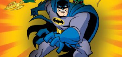
First off, you should know what prey-tell I was gifted. DC’s Justice League Beyond, as pitched to me by Mike Gold, was “…perhaps the best straight-forward action team book being put out today.” Well, given Mike’s pedigree and tastes, I was willing to bite on that. And with no more pretense than that single line of praise, I tore through 12 digital issues. At the tail end of them, I’m happy to report Mike is very close to right with his kind words.
JLB is an extension of the animated Batman Beyond Universe, birthed by our lords and saviors Bruce Timm and Paul Dini and brought to us by the writing, penciling, and inking team of Dustin Nguyen and Derek Fridolfs. And much like Dini and Timm’s futuretoon, the digital book appears light as a feather in presentation, but its looks are truly deceiving.
Beneath the veneer of simplistic art and truly light prose, comes a world-shattering tale worthy of the Justice League. Backed by a few “secret origins” to break up the main story, a solid hour of reading gave way to lasting moments of truly memorable scenes and concepts. Case in point: Fridolfs and Nguyen are able to create a New Gods story that is near Kirby-level in its weight and presentation. If that isn’t cause enough to pause, well, I don’t know what else is.
From the visual standpoint, I’m less than thrilled. I get that the appeal of the book ties directly to its parent animation. But in the realm of comics, there’s far more to do than just replicate someone’s style and call it a day. Call me crazy, but I’d like to see them reach a bit further visually then what DC delivered. Without knowing anything beyond what I was reading, the books ‘looked’ just the teeniest bit phoned in. It could be the stylistic choice of editorial to match the show so closely.
The truest compliment I can lay out though comes in aforementioned origin issues. Meant as breathers between the main “War to end all wars” arc, here we get glimpses into the backstories of two characters that never struck me as more than filler bodies. Warhawk and Aquagirl are each given a backstory treatment that would shame the king of origins, Geoff Johns. Delivering real pathos, enhanced by a few Easter egg nods and winks to the comic historians amongst us. And for those (like me) that lived-ate-and-breathed the Dini/Timm-Verse? Well, this whole series is like a trip back to a better time. And better than that, they took the time in both cases to try a different visual approach. Loose and simple still, but with enough of a change to allow to enjoy the stories on a higher level.
But the crux of the matter to me was in the enjoyment. Did I have as good a time e-flipping through the pages as I do with normal comics? Sadly, no. To be fair, I tried reading the files both on my large iMac screen and my wife’s iPad – which is as close to the size of a single comic page as one can get digitally. The book itself is cut in odd places. It was hard to tell if it was built in “standard” format akin to be eventually printed, or if it was always intended only for digital consumption. Given what I saw, I believe it to be the latter. And that in and of itself isn’t a dig. For the longest time, I enjoyed DC’s Zuda line of web comics mostly due to its formatting being suited for the screens at the time. Here though, the digital books read just a bit wonky to me. Some pages are portrait, others are landscape. And although each issue is 20+ pages, in some issues there’s barely six or seven actual pages worth of content.
I am all for the idea that the comic companies shoot to create all digital publications; it’s the future whether or not I’m an adopter. But the key here needs to be the same as it in print. That is to say the final product need not short the reader with content, just because its home is on the backlit screen of a retina-display.
At the end of the day, I know that this initial pass into the non-inky realms was not enough to lure me over permanently. That being said, I would be more prone at this point to enjoy digital titles should they wholly separate entities built specifically for the medium. And if they are significantly less money than the printed counter part (akin to the music or TV episodes), then I’m even more likely to consider incorporating it into the fabric of my e-life.
Most important though is that the quality is no different on screen than it’d be on the page. When you have to make art that is only 72 DPI, it can be tempting to become chinsy with the deliverable (both in words on the page, and the stories delivered per issue, as I was noting in the over-before-they-got-started JLB issues). The comic brethren must remember that the digital music and movie media eventually made their way to HD.
With all of those pieces in place? I can rest happy that my son may end up collecting his longboxes on a hard drive instead of a basement. Assuredly though… this digital-aged bearded bloke will still be bagging and boarding his wares until they stop putting them in the stores.
SUNDAY: John Ostrander