Now – Classics from the UK
 Remember how last Sunday I was lamenting the lack of comics based on classical literature by, say, "Virginia Woolf or a Bronte or two?" Well, via Down the Tubes comes news of a new UK-based company starting up to tackle even more classic literature in a graphic format.
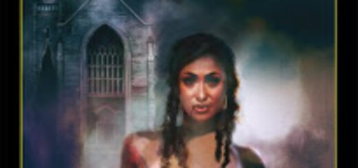
Classical Comics hopes to have its first titles up and running by next year, and lookie here (at right), Jane Eyre will be one of them! (Not only that, but it will be adapted by Amy Cozine — great to see more women writers turning to comics!)
CC’s first adaptation, of Shakespeare’s Henry V, should be out this October. Forbidden Planet International has some sample pages. Also planned are adaptations of Macb— er, The Scottish Play, as well as Dickens’ Great Expectations. Which definitely describes my hopes for this company. The more ways we can reintroduce cool books by dead writers to new readers, the more we can immortalize their wonderful prose.


Another nice installment. I look forward to every new part of Lone Justice.
The panel at the top of page #117 is a stylistic shift. It almost looks like a bit of coloring that didn't go through the same blending/smoothing/wash process that the other panels get. Or that there is a layer of lines missing. It's still a pretty panel, it just sticks out from the others.Also, the lettering seems half done. There are no tails on translucent balloons for pages #117, #118 and the top of #119.As far as the story goes. I really liked this. The love scene is particularly well done. I didn't think it came across as gratuitous or salacious. Just funny, sweet and romantic. Nice!
As usual, Russ, you pick up on everything!That panel is supposed to be evocative of a WPA poster. I know it is a subtle idea – but I think it tells the story even if you don't get the reference. And the word balloons are non-specific to the action pictured – that's why they "float".
OK, I can see how the translucent word balloons give the idea that this is a conversation that has been going on over the period of time of the montage, but not specific to any of these images. As if this is a topic of conversation that's come up again and again and again over several weeks or months.And you are right, the panel at the top of #117 is evocative of a WPA Poster. It's nice that you can "see" the sunrise reflected on Octavius' face. But once you mention that it's a WPA Poster, I want the figures in the panel to be making a stronger statement. Pointing to the horizon! Holding a hammer (or sickle). Lifting a baby. It's funny (or just appropriate) that those are the very images that follow in the montage.
Wow Mark, looks like Russ got a little cranky didn't he? I liked this installment as well. It's a nice breath and pause of the action we've been recently experiencing. Good to see Octavious taking the LJ concept back to the drawing board to renegotiate just HOW he'll be a hero. Looking forward (as always) to the continuation.
Yeah – I was really pushing for LJ to go with the purple hood — :)