Doctor Who episodes online…
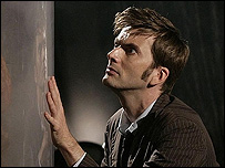 Stringer Lisa Sullivan notes: "Doctor Who is scheduled to be among the programs to be made available on demand via the BBC’s iPlayer service. BBC News says the service will be launched later this year.
People will be able to watch selected shows online for seven days after their first broadcast. Episodes will also be able to be downloaded and stored for up to 30 days. The iPlayer has been given the go-ahead by the BBC Trust after consultations with the public. Initially, the iPlayer application is only available for people with Windows PCs but the trust wants the application to run on different systems within "a reasonable time frame."
It is unclear at present whether access will be limited to UK users, but based on their previous actions with the interactive comic, it’s sure looking like they’re going to try.




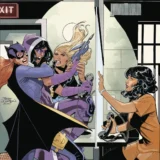
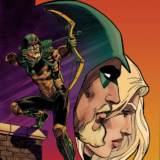

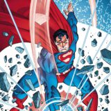



Good episode. Thayer is a dick. I hope he get's what's coming to him. When Thayer was talking about diverting the river, it made me think about the Johnstown Flood of 1889. He's evil. And I can't exactly figure out why he's evil. It's more than his callousness toward his cousin. Maybe it's his playing with toy trains. That's somehow controlling and diabolical. But something's hinky with that guy. That's good writing and good art. When you get a "feeling" and you can't say why it's there, it means this is working on multiple levels.One small note. When Octavias calls Thayer, "T", that reads perfectly fine to me. I recognized immediately that "T" was the man's initial. But when Thayer calls Octavius, "8", I couldn't figure it out. I was like, "Is that an ampersand? Is that a G?" I kept thinking that is was also an initial, and I couldn't figure out which initial. Out of context, it just didn't read as an "8". I think if you changed, "8" to "Eight," it would read better. I know, it wouldn't have the visual balance of "T" and "8." But they are speaking, not writing. When you are talking about the letter "T" you say, "T." Not "tee". But when you are talking about the number eight, you say, "Eight," not "8."Congratulations on continued punctuality of Lone Justice. These pages come out with such timely precision, I suspect that the whole operation is automated! It's like clockwork. The story and art are far more organic, but just as consistent and excellent. Thank you.
Feelings, nothing more than feelings—I take your point about 8. On my high rez screen – it looks fine – and at larger sizes it still looks fine. But I could see using a larger, more clear and graphic style 8 – and it would work better.Keep your eye on the punctuality – I've had one disaster after another for about a month now that has severely cut into my creative time. I keep hoping this week will be the week that I can actually get into the studio and get useful work done. So maybe it will be this week. If not – the schedule might burp in about a month.Does this add suspense? Time to start an office pool?
Another fine chapter Mark. What I enjoyed with this round, as with previous ones, is your color choices, and pacing. This chapter is all about dichotomy… From our hero's desperation, to Thayer's solace. The motif of men who play with trains is not lost on me. Thayer obviously has a complex with power… but we've yet to see if he needs to control his tiny world, or if he's addicted to power. I was a fan of the loose ended panel of page 3 of that chapter… it's added to the overall painterly effect you go with. It was nice to have a chapter about words, not JUST gadgets and punching. Don't get me wrong… I'm in this for the gadgets and punching… but it's nice to take a break and realize you can craft a damn fine story amidst the action. Kudos again.
Thanks, Marc. I'm glad the talky scene played well for you. Taken in context with the entire graphic novel a scene like this would slide right by. But when we deliver the story scene-by-scene I think we end up with wild changes in tone from week to week. For me this defines the difference between a series and a story. A series should strive to deliver the same basic beats and elements with each new episode – just rearranged and dressed up with new, clever surface details. But a story has an arc and is all about change.
Exactly Mark, and it's well appreciated that your careful consideration seems to be applied instead of submitting "chapters" to us in a less than stellar fashion. If I may ask, when in production, how long does it take you to color a page?
Usually I blast through coloring a page in whatever time I have. It really is the final step and gets the least amount of my attention. I can get very interested in setting the look of a new scene – but after the first page or two it becomes so boring for me that I have to perform mental gymnastics just to stay awake. I've known a lot of artists because of Insight Studios. And I've gotten the chance to watch them work – and not work. And the artists who have deadline problems are usually the ones who find drawing easy. On some level it bores them to work out the drawing – the moment they thought of the page, panel or illustration, they saw the image in their mind and the "fun" part of the work was done. It is at that point when doing the rough becomes the major point of interest for an artist. That's why I enjoy collecting the sketchbooks that artists publish for conventions. Coloring is like that for me – it comes too easy and bores me – unless it is a new scene or a more elaborate illustration. (Fortunately everything else about creating comics is just enough of a challenge that it doesn't frustrate me and does keep my interest up!) But the answer to your question is, I can usually color a page in an hour or less. And if I have less time, then I design the look of the page to allow me to color it in the less time that I have. What is more likely is that I make the page more elaborate to keep my interest up and end up setting a style that causes me to invest more time than I really should from a business POV. You would not believe the amount of time I invested in re-coloring the MARS collection from IDW. Sure looks nice though.
Since Unshaven Comics is a team effort, I'm a colorist for the most part right now (and 1/2 of the writing team) so I still find alot of "fun" when I color a page… mainly because 1. I wrote the page I get to color, and 2. my penciler is my best friend, and his reworking of my writing into the page still makes me giddy — and then makes me want to do justice to his work in turn.
The fact that I'm telling a story is what keeps me doing my own color work – well – that and the fact that everyone seems to like what I do with color. But you really can notch up the drama and even reinforce story points with the color. Often I will compare color in comics to lighting a scene in film – and that's true from a tech POV. But the impact that color in a comic can have is a lot closer to what a good soundtrack can do for a film.I think that the storytelling aspects of color are pretty much ignored by most comics and the fans and just about everyone. So kudos to you for having the opportunity and knowing what to do with it.
MARS was the series where I first discovered the magic of Mark Wheatley and Marc Hempel! I need to dig those issues out of the longboxes in the basement. Or I could put the IDW collection on my birthday Wish List. I would like to see the recolored pages and there are 32 pages of new art and bonus features too. Hmm.
Interesting thing about the color on MARS. We get into some of this in the bonus features in the collection – but we didn't really talk about the discussions we had with the FIRST COMICS crew about production techniques before we started the series.Marc Hempel and I had both been doing work for HEAVY METAL magazine, as well as illustration work for books and advertising. I really liked the painted look of the European comics and I had gone to a lot of effort to learn those production techniques, even invented a few of my own. Eventually made a good deal of money from an early digital scanning innovation (pre-personal computer days) that I called DIGI-COLOR and a special paper that Insight Studios began to manufacture and supply to the comic book publishers called STABLE-LINES. I say this to establish that I knew a little bit more about printing and production than the average comic book artist.To their credit – the guys at FIRST (including Mike Gold) listened and considered our proposal to do painted color on MARS. But ultimately they decided to stick with the then standard comic book package. And I could understand. It is hard enough to get a small comic book publisher up and running without trying to make changes to everything, reinventing the wheel. I think the real failure on the project was mine – in that I did not make the full extent of adjustment in the art style to accommodate the flat comic book color. Marc and I were still seeing a more elaborate color finish in our minds, and even on our color guides, than was getting across in the printed books.Then – just to keep it interesting – FIRST got into a pissing contest with the major comics publishers who were using the same printer and suddenly found themselves scrambling to find new printers for their comics. So I had no idea how each new issue of the series would look in print. And there were some real surprises – good and bad.The bottom line is – over 20 years later I had an opportunity to get it right in the IDW collection. I and my assistants put a lot of work into doing the color work over – and IDW went the extra mile to get the best printing job I've ever seen on one of my books. When it was all said and done – Marc and I looked at our old art and were happy to find that when it was presented the way we wanted in the first place – it looked very good indeed. It doesn't usually work out like that. Usually I cringe when I look at my old work. But it was almost like MARS had never really been finished until the IDW collection.
A great little history there Mark. As a graphic designer, I've had my fair share of training on modern printing processes, but obviously, having only been a working pro since college, I'm from the "new-fangled" modern era of digital web presses, etc.If it's good in the pdf, it's good on the page. But I'd like to think that the real challenge now is utilizing the RIGHT tools in the digitial sphere to accentuate a project… which I feel is one of the strongest points about the art in LJ:Crash.
By far – computers have made printing a much more responsive experience. Back in the dusty early days we had to guess at what color images would look like in print. It was an educated guess, but there was always a hit-or-miss period when you started working with a new printer. And proofing was just "in the neighborhood" – I didn't get progressive press proofs until I became my own publisher. And by then I was using computers and didn't need it so much.The old color guide system was real artistic torture. My assistant and I would paint our beautiful little comic pages on glorified photocopies. Then we would cover the painted image with arcane notations that specified the mix of color tints on CMY(K was always 100%) – and then this was sent to a moonlighting housewife who was working for minimum wage in New Jersey or Connecticut who would make a quick attempt to duplicate our original color efforts using layers of film and film opaque – a thick lead-like paint that always reminded me of clotting blood. The fact that the final printed page looks anything at all like the original guide was amazing.All hail the PDF – and the web offset and digital presses these days are things of beauty. And for these internet comics – the file you see online is the file I delivered. Any difference between what you see and what I see is entirely up to your own settings on your computer. I guess the biggest area for discrepancy these days is the screen resolution. Which raises a good question – what do you have your monitors set to? My internet computer is kept at 1280 x 1024. My art computer runs at 1600 x 1200.
I just upgraded my system at home to a 'hackintosh' … I run 2 19" widescreen monitors… which provides me with enough landscape to really work freely. I have 2 video cards so I run on my cintiq and 2 monitors at the same time.. its making for a great setup thus far.
Sounds like a great set-up. I really should bite the bullet and move the phones and music equipment to give me room for the second monitor. I have the video card for it.
I find it makes life easier, when it comes to having… IM windows, a brower window, or other pages / sources open.